Rebrand for WINBOX
Overview
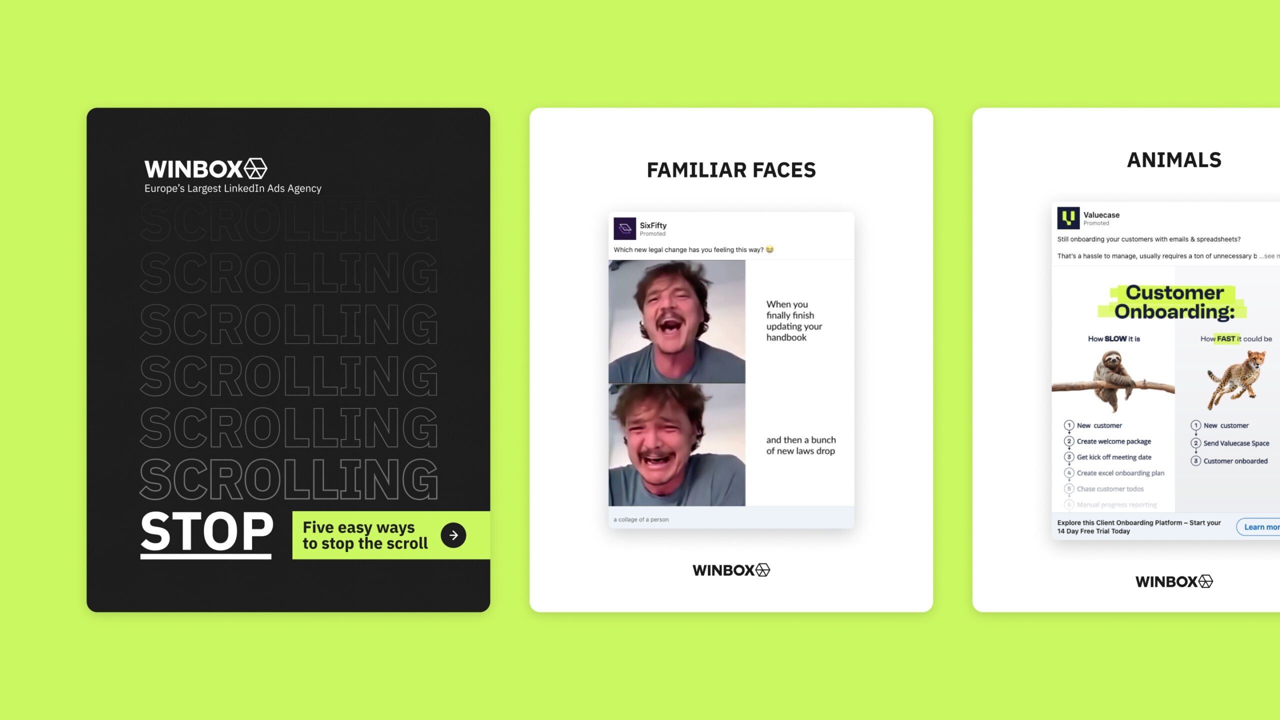
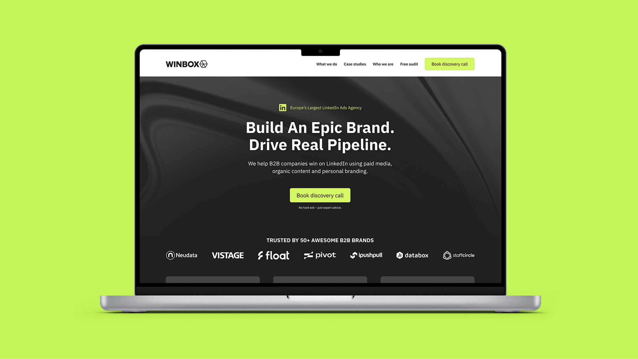
Winbox is a LinkedIn marketing agency specialising in the B2B sector. Having launched with a minimal brand, they had grown to a stage where they needed a more cohesive and attention-grabbing identity that worked alongside their existing logo. Winbox wanted to look like the “cool guys” on LinkedIn, specialists with insider knowledge and a practical, confident approach.
Concept
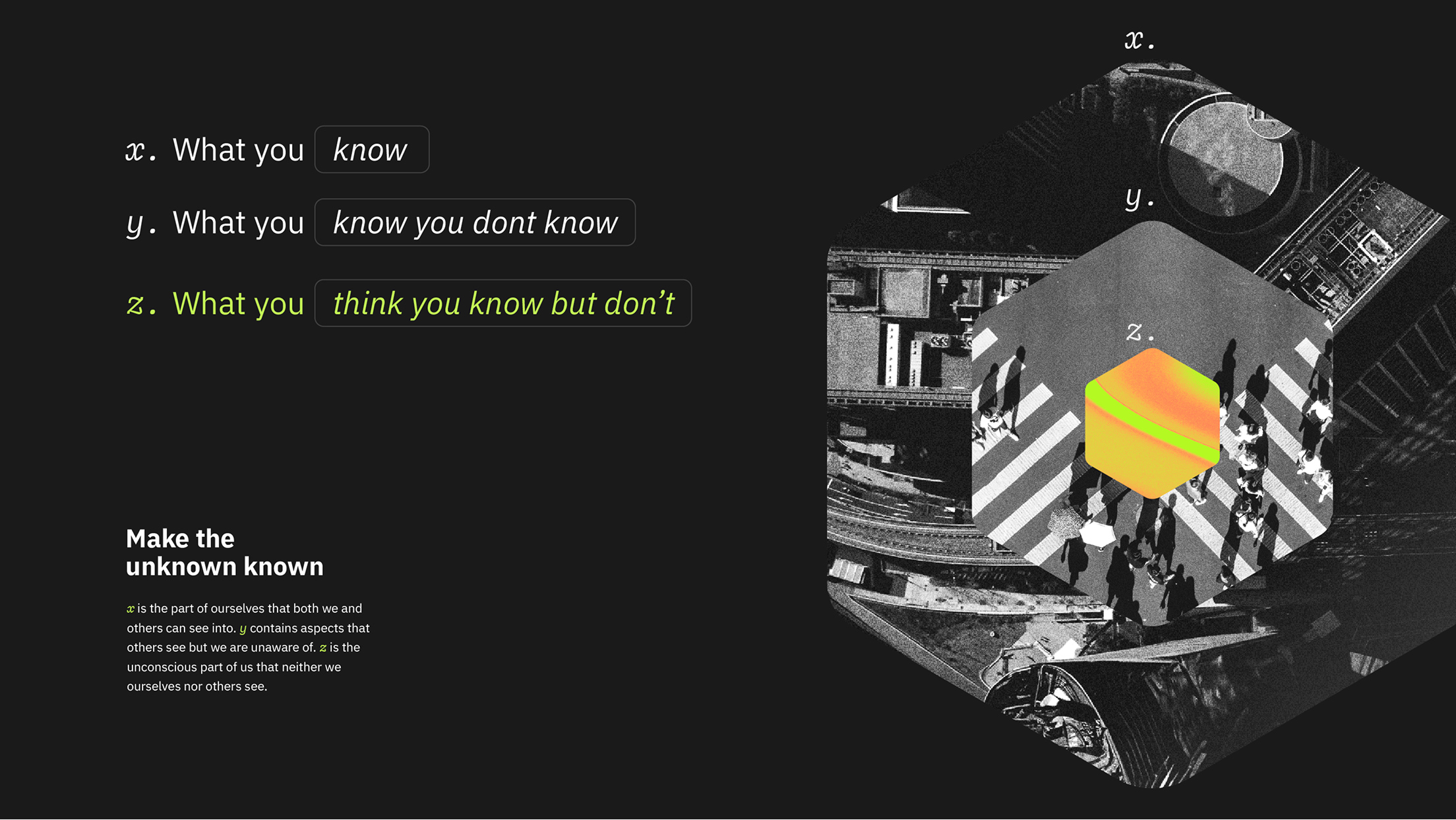
The rebrand centres on the idea of digging deeper. Having a fuller understanding of people, getting under their skin, and using the nuances of LinkedIn marketing to best effect. The concept aims to spark a little FOMO: Winbox has the secret knowledge, intelligent strategies, and creative chops to pull it off.
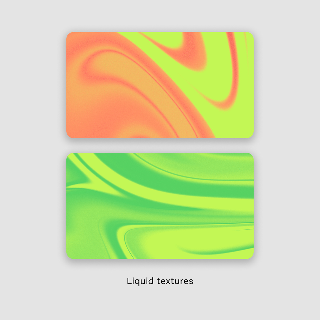
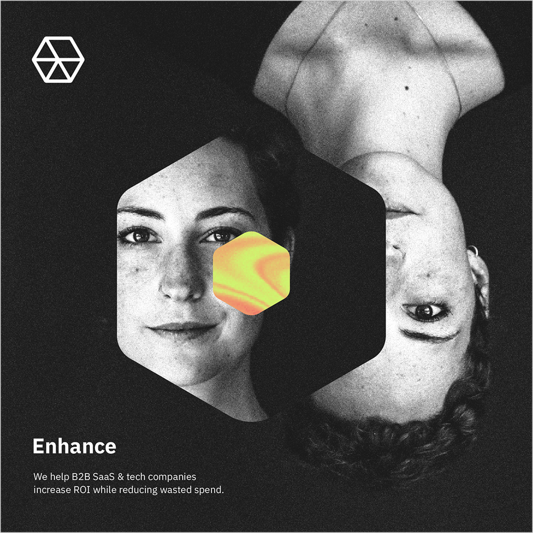
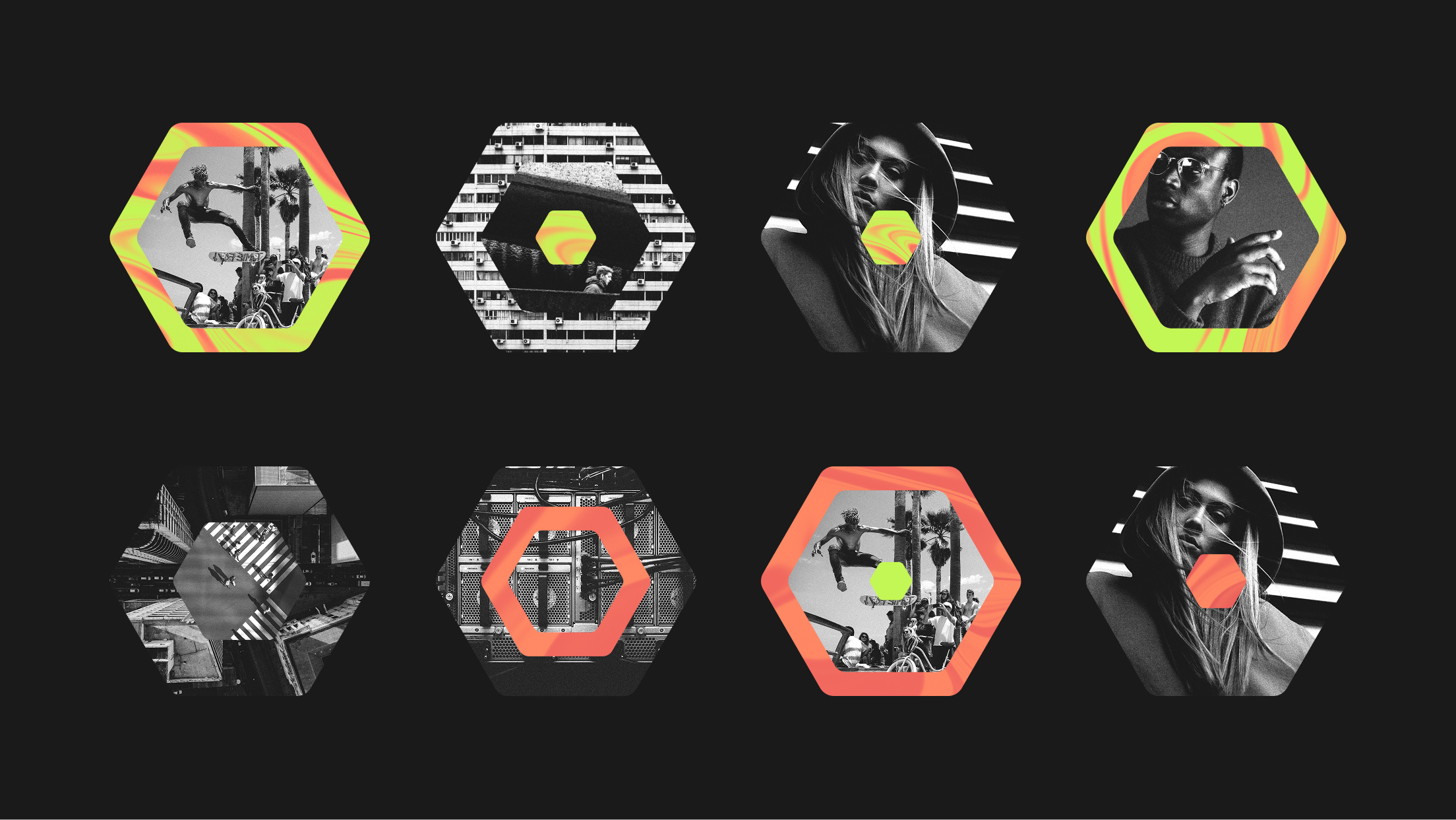
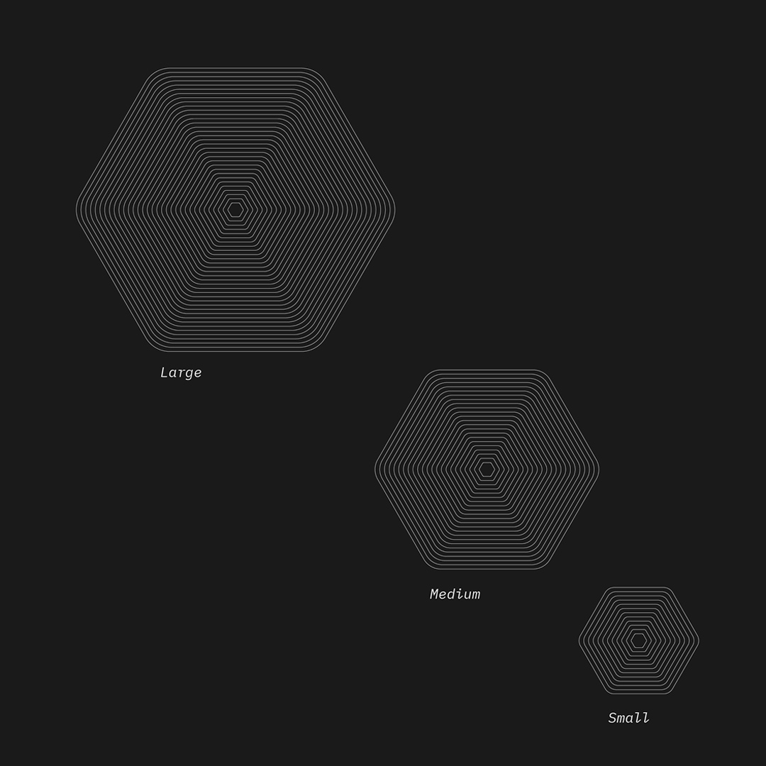
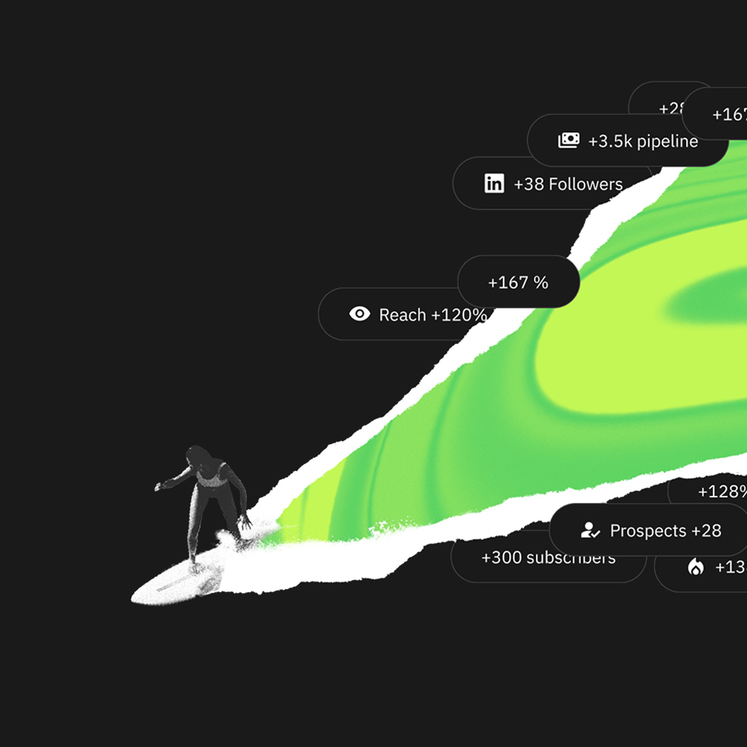
Visually this is expressed with layered hexagons. Peeling back layers to reveal a hidden inner world that’s vibrant and unconventional, while liquid textures reflect the ever-changing nature of LinkedIn marketing.
Winbox
Responsibilities:
Branding
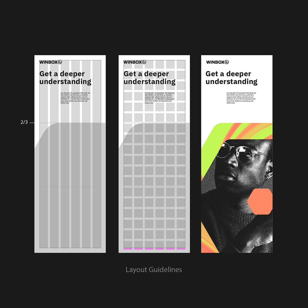
Brand guidelines
UI/Web design
Asset design
Year:
2024-2025

Photography

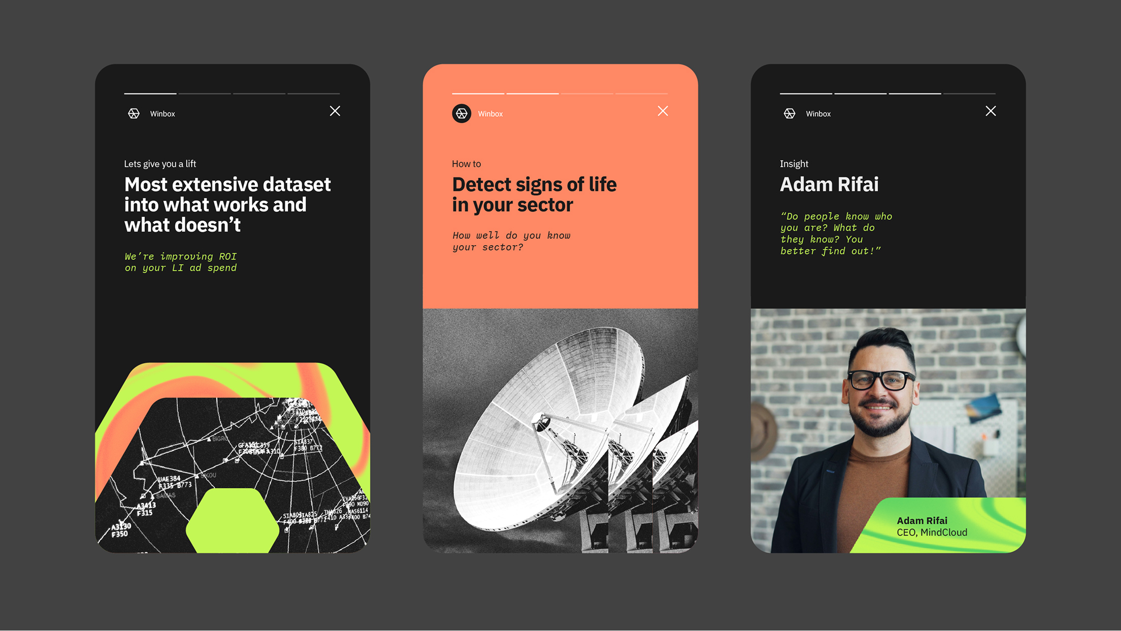
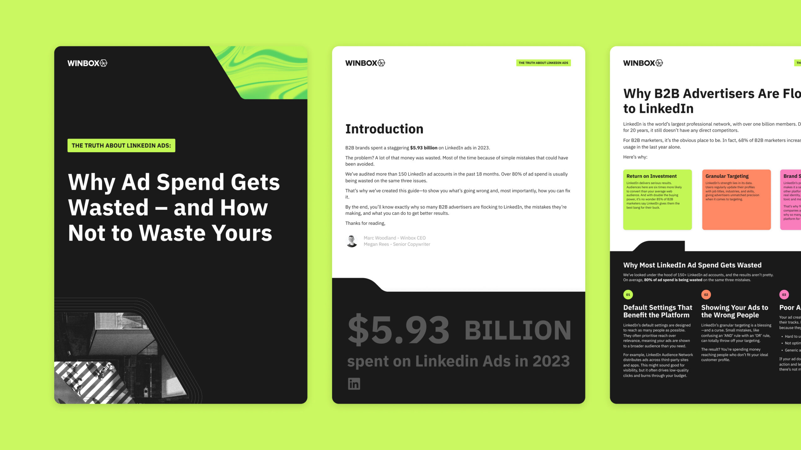
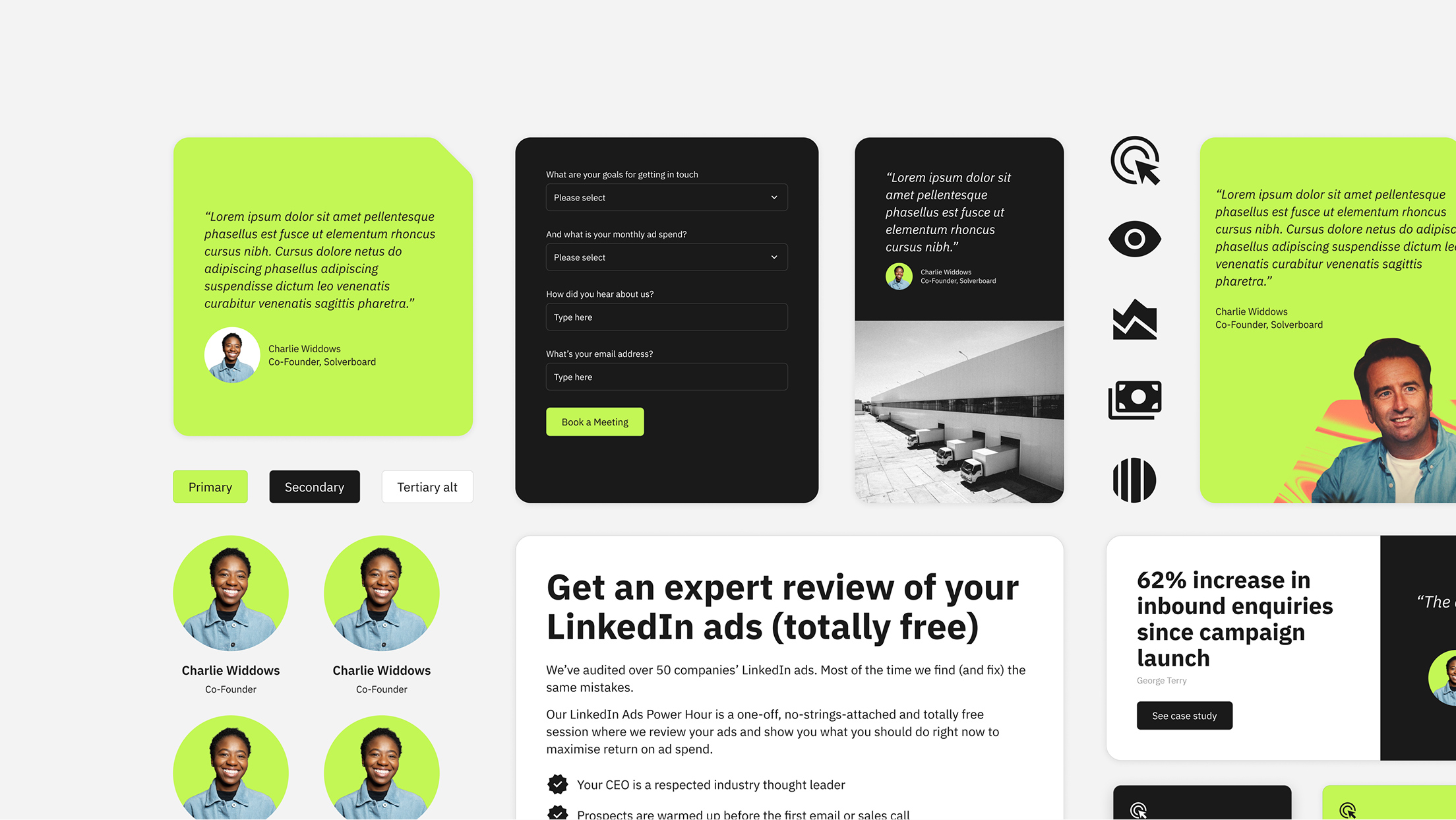
Brand guidelines & assets
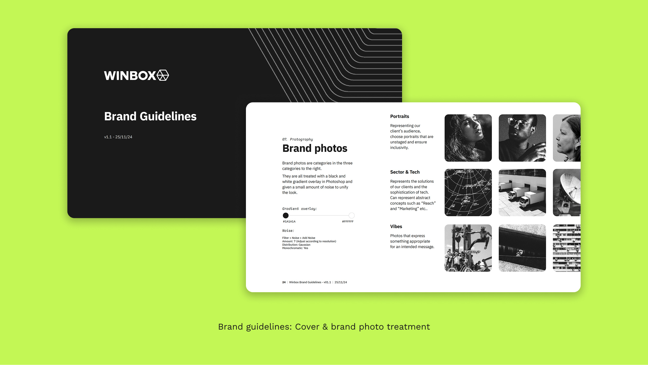
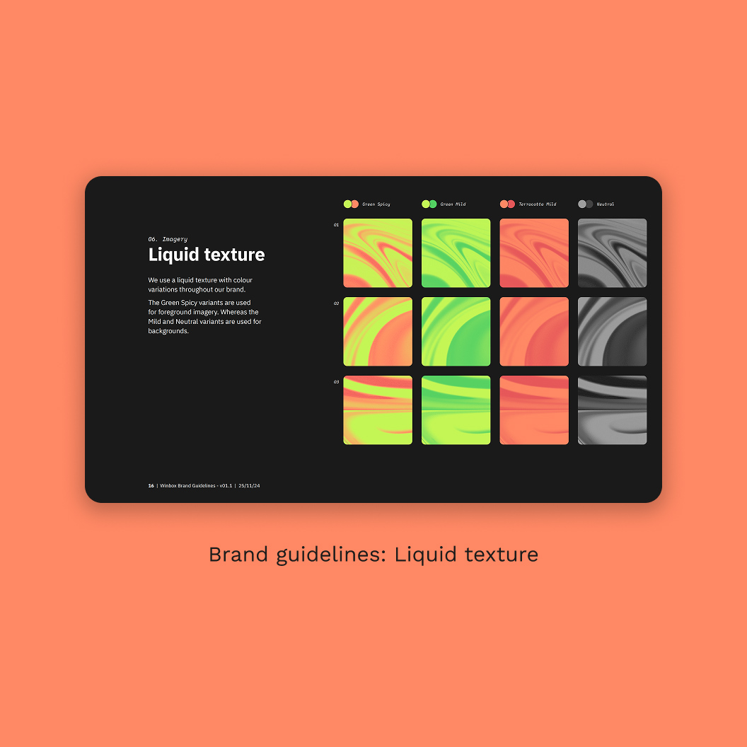
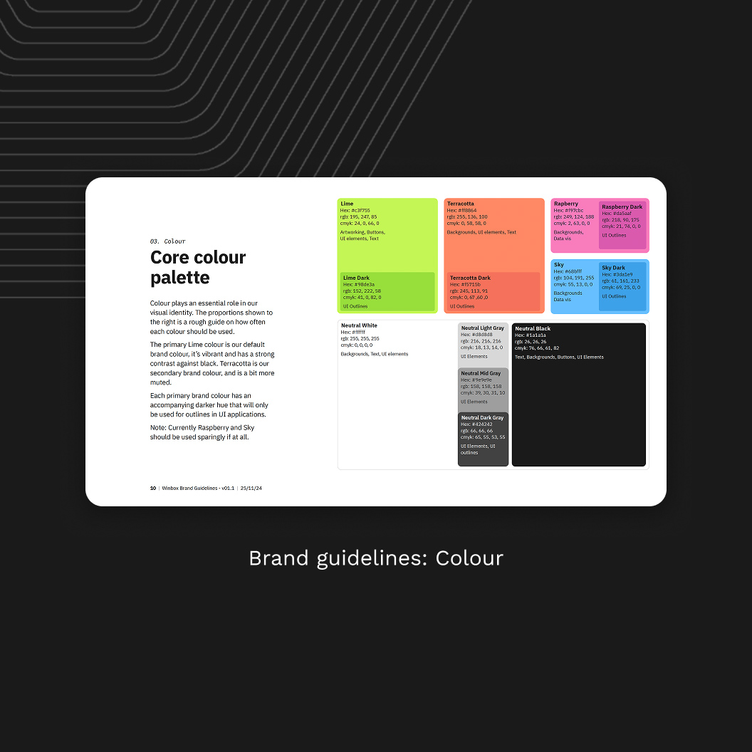
Website design and imagery update
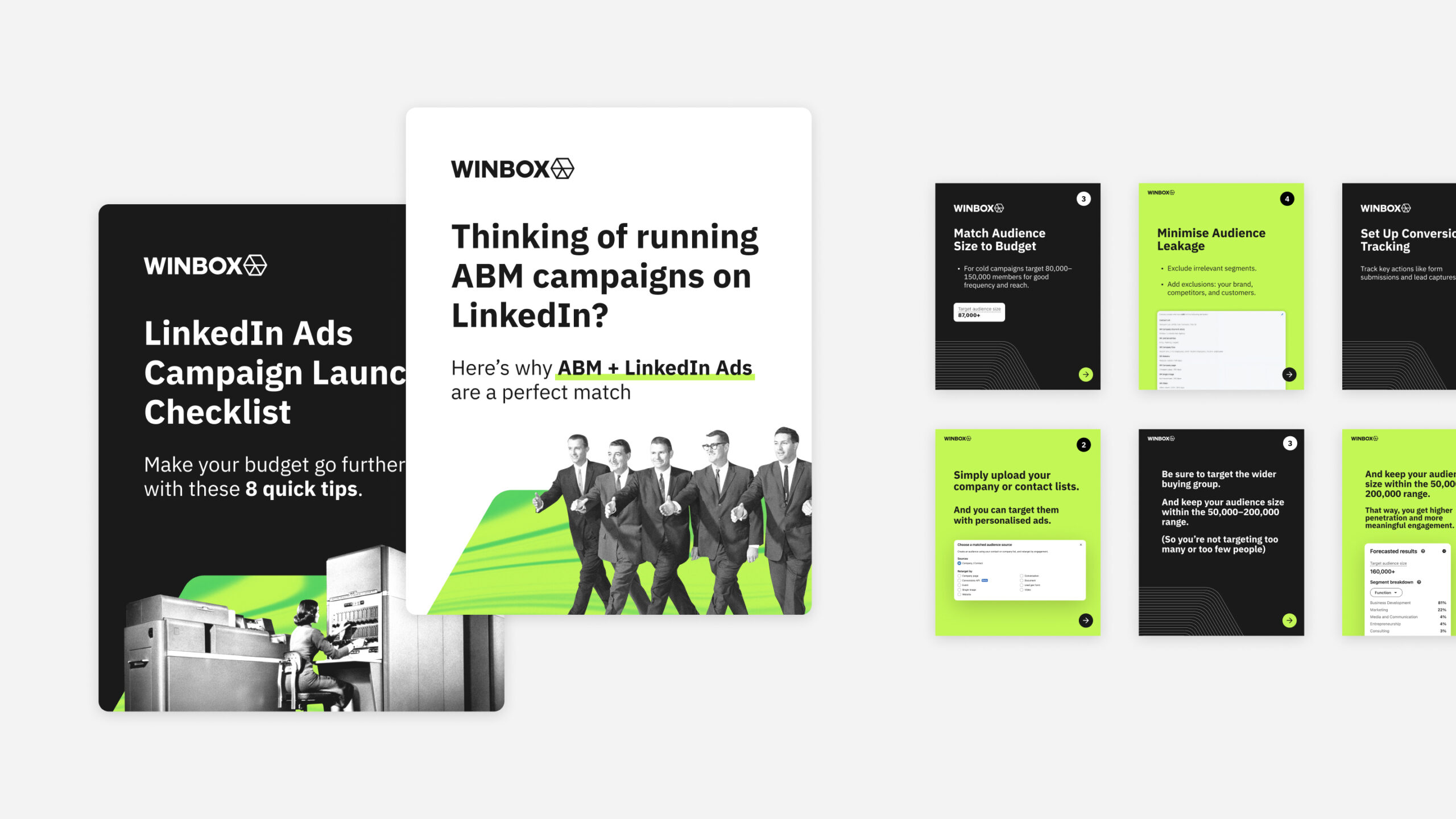
A while later, Winbox felt their photography was too serious and not quite grabbing attention. They wanted to lean into a more distinctive look by focusing on archival photography. After some experimentation, we landed on a fresher, more upbeat expression, and thanks to the component library, we were able to roll out the changes quickly.
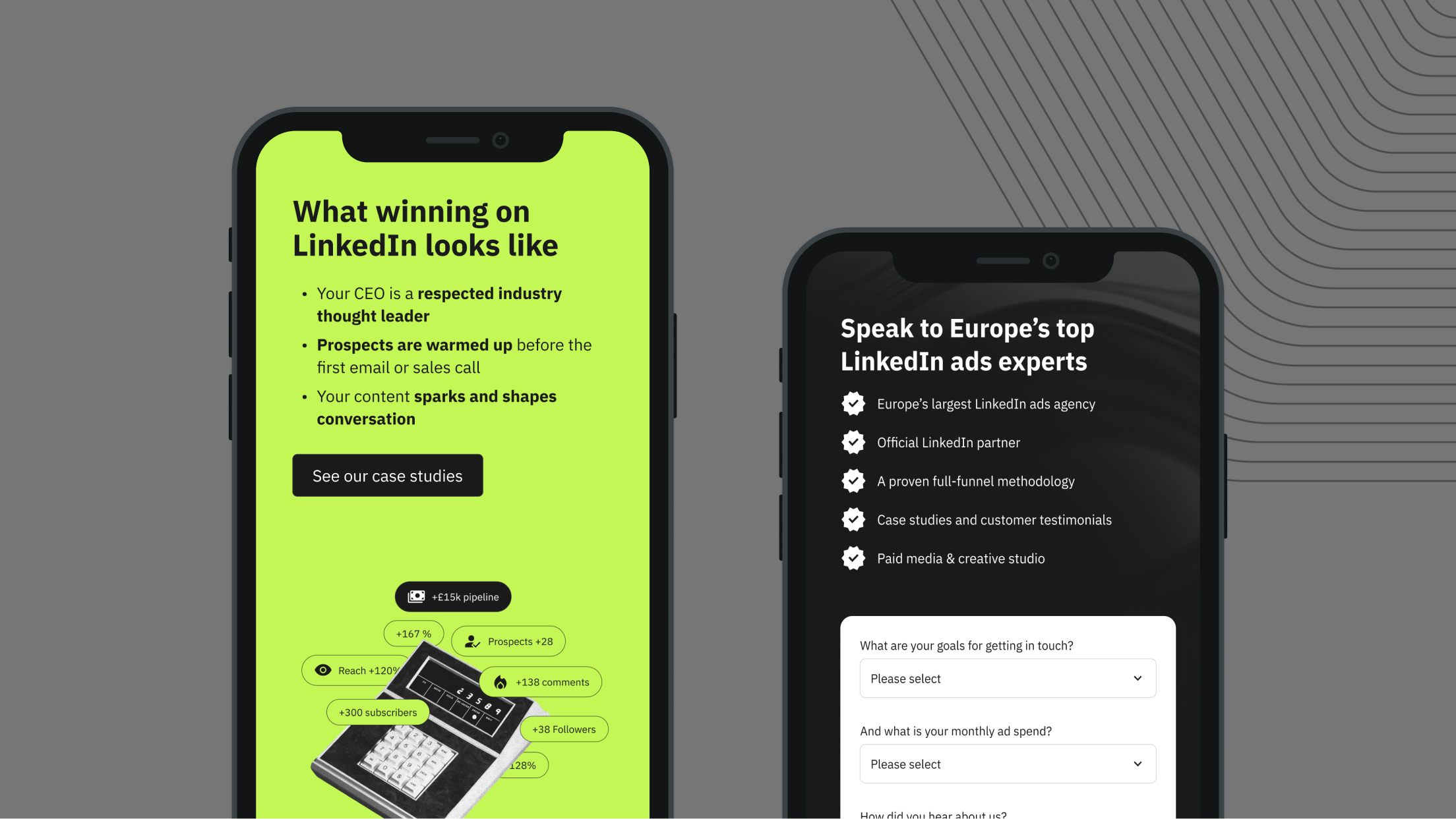



LinkedIn marketing assets
