Rebranding with precision and gravitas for Ternan Energy
Overview
Ternan is an energy consultancy focused on preparing offshore sites for wind farms. Their brand had gone untouched for years, which made it difficult to communicate their services consistently across different channels.
Concept
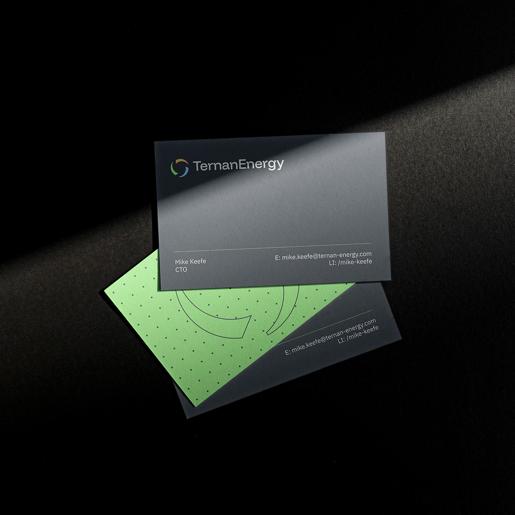
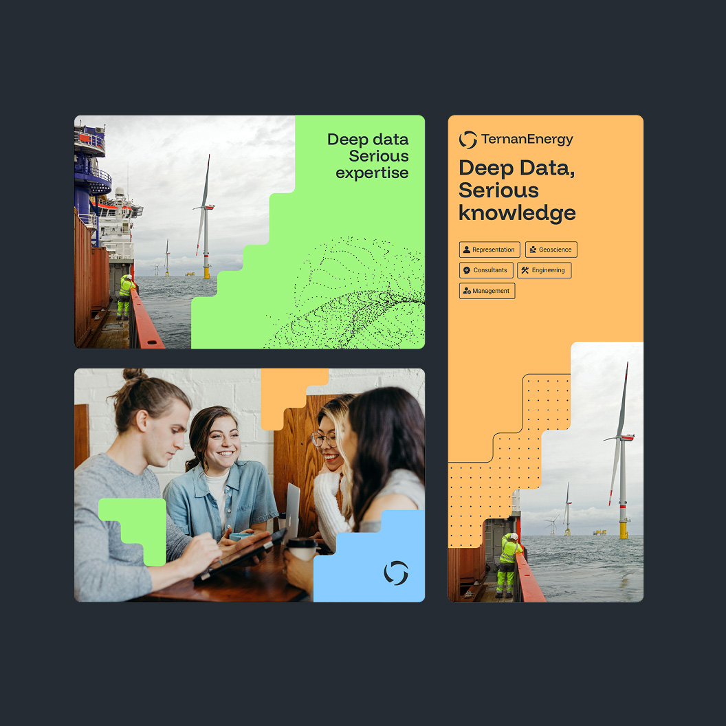
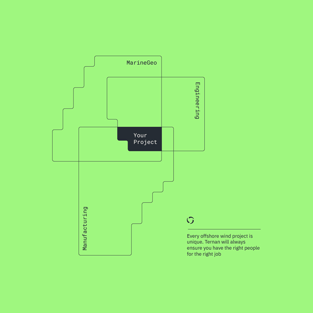
The rebrand draws inspiration from mapping, data visualisation, and problem-solving. Dot cloud patterns reference the seafloor ground models the company produces, while the graphic elements suggest both depth measurements and interlocking puzzle pieces. The result is a confident identity that communicates technical expertise while remaining vibrant and expressive.
Client:
Ternan Energy, Commissioned by Make the Break
Role:
Freelance designer (Lead)
Responsibilities:
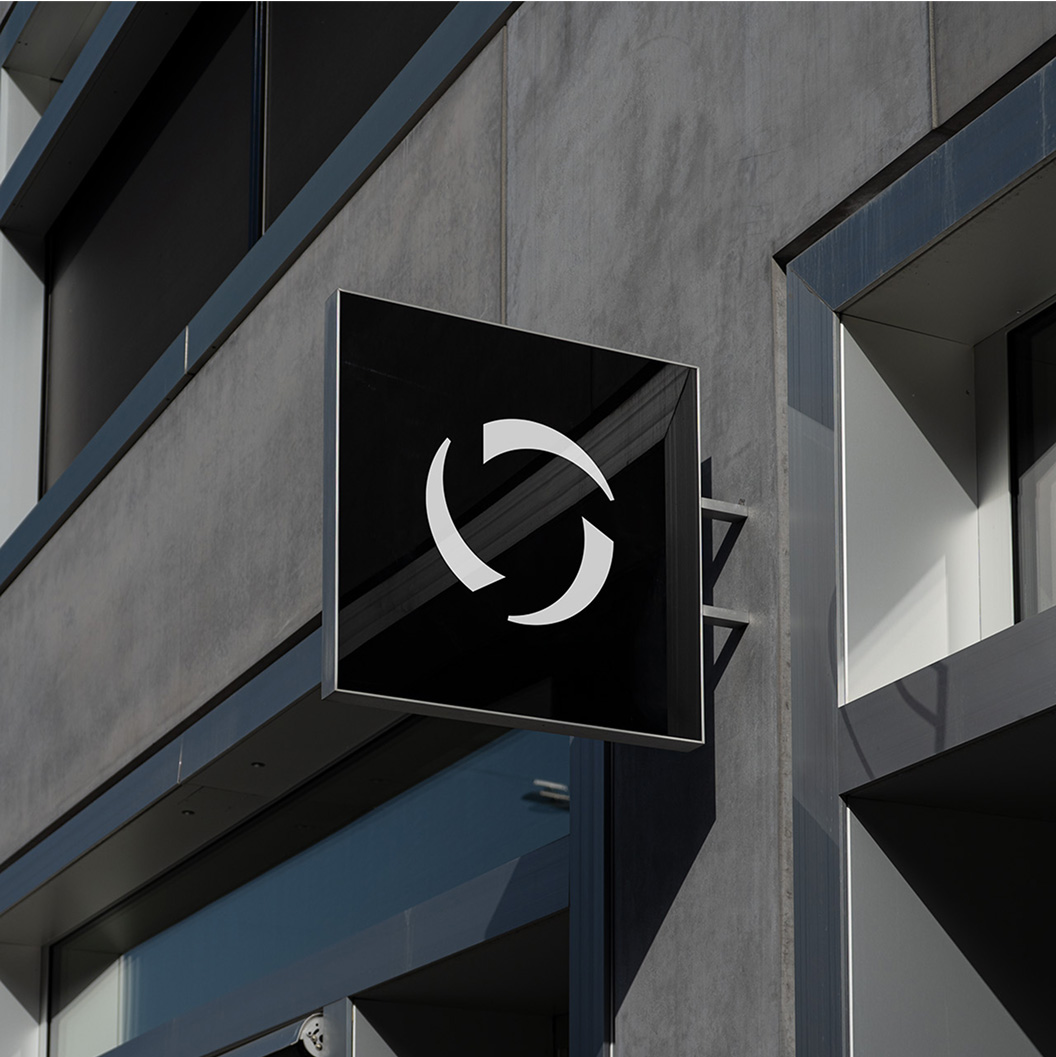
Visual identity & logo design
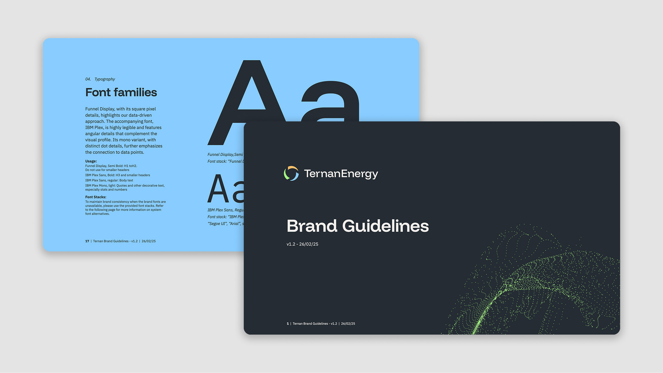
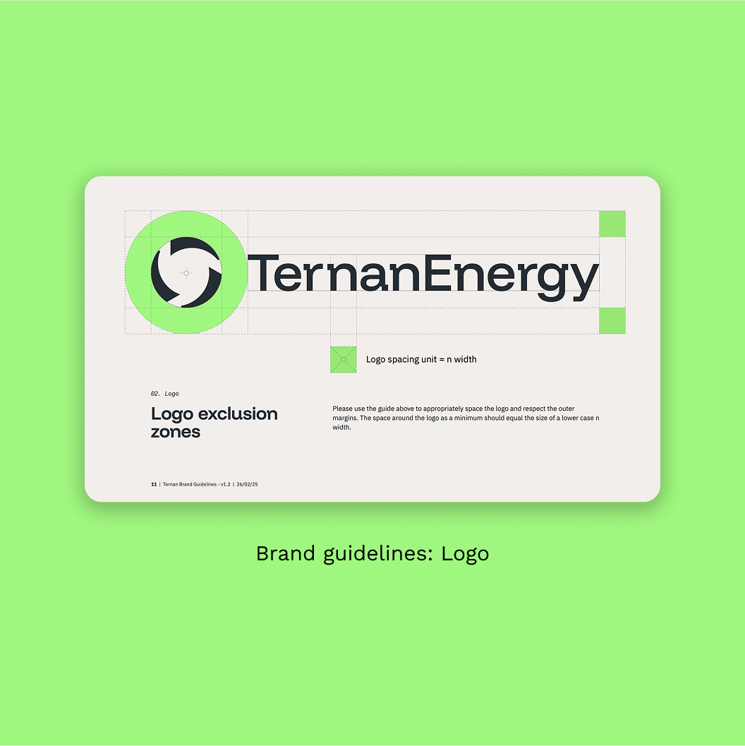
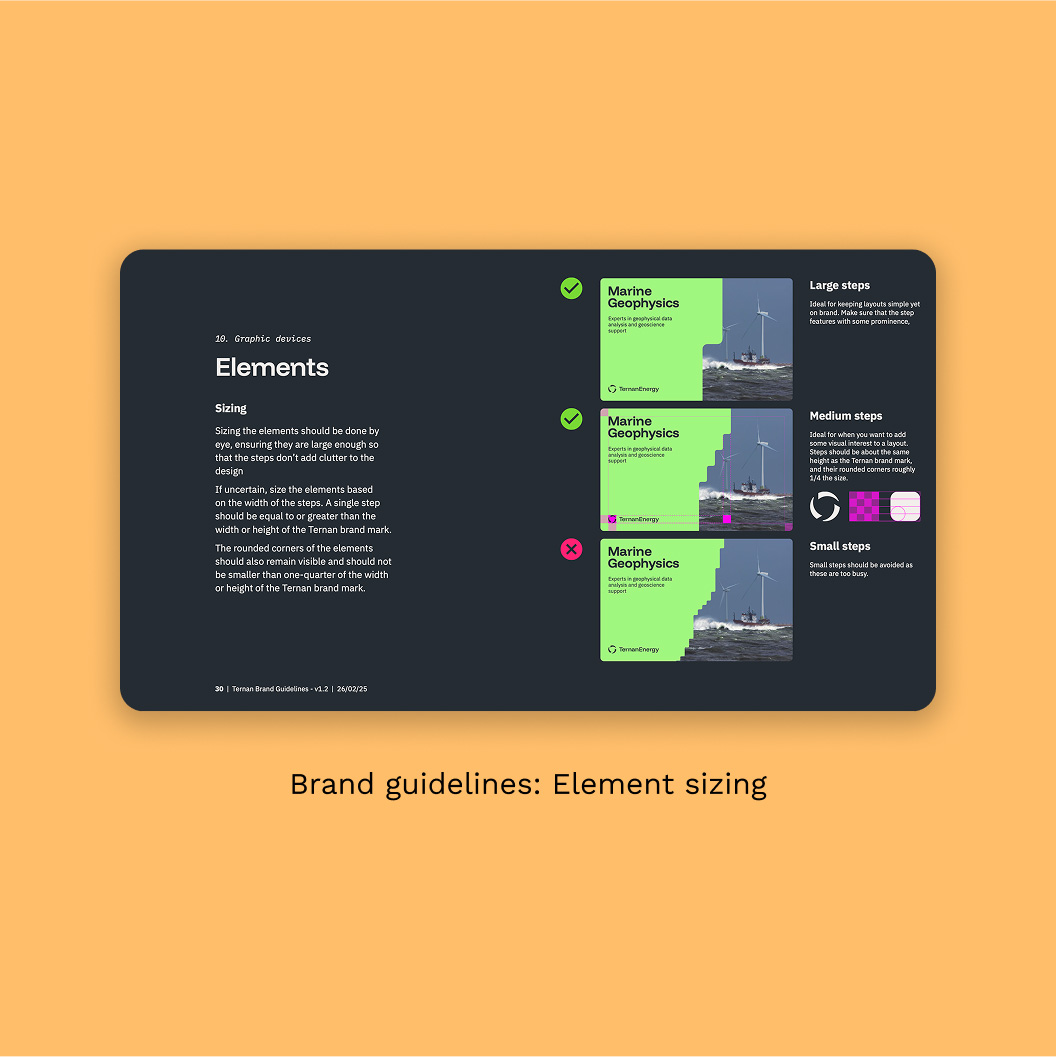
Brand guidelines
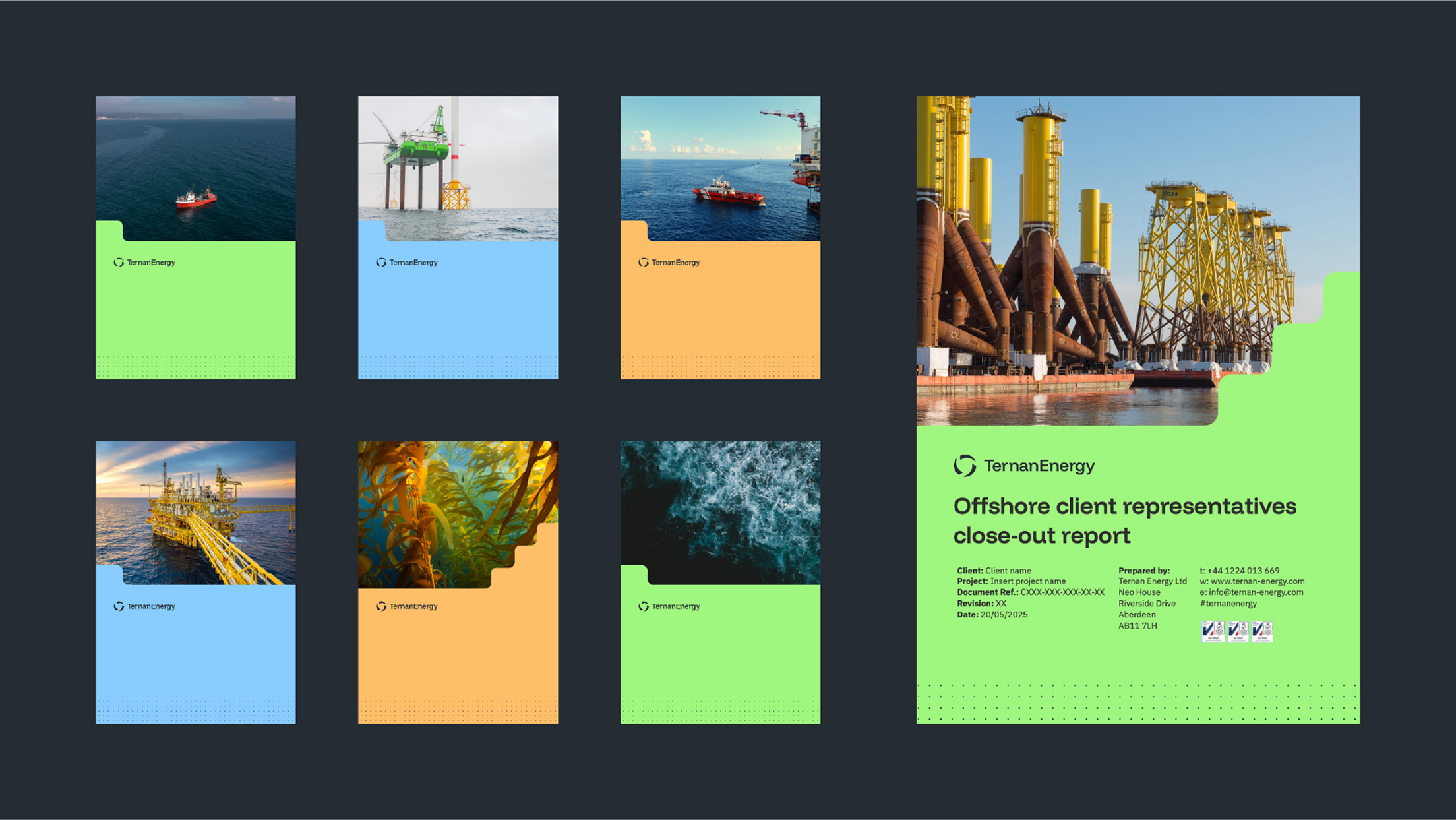
Reports and templates
Year:
2025


Elements
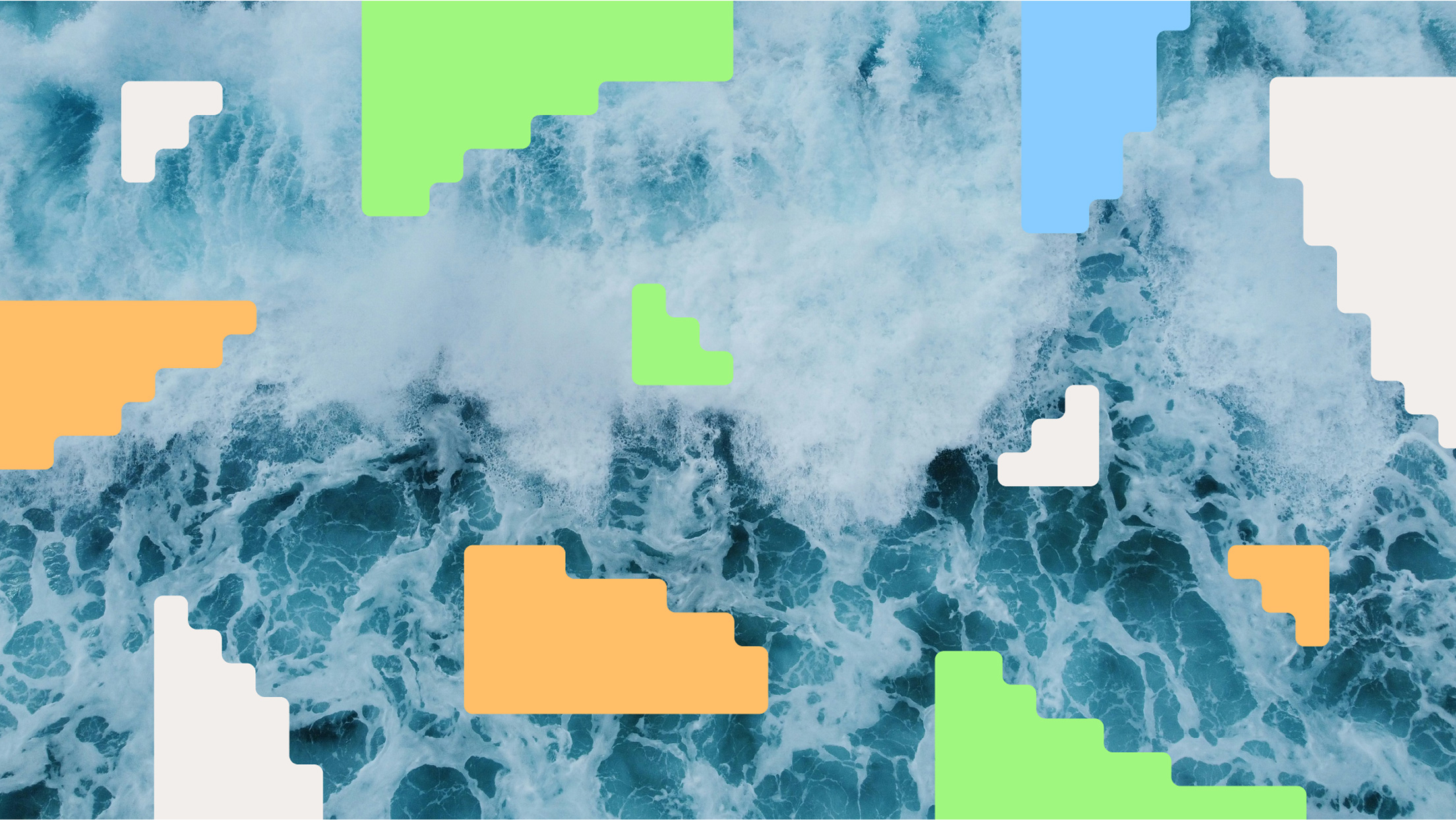
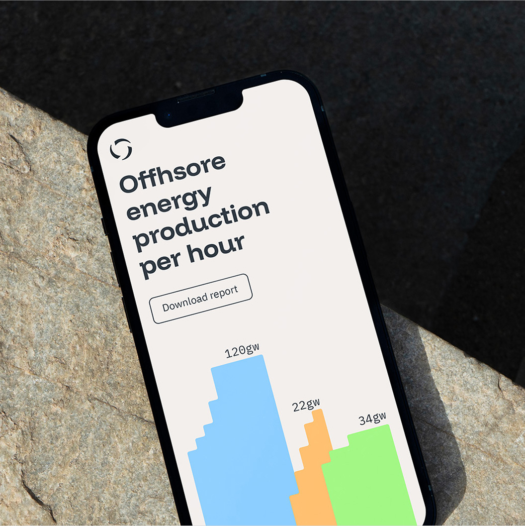
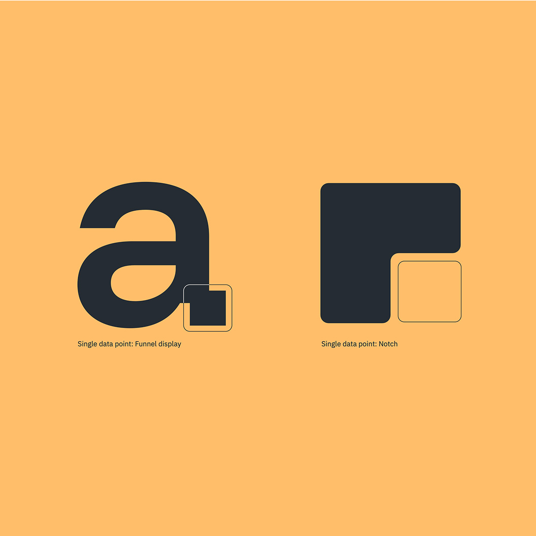
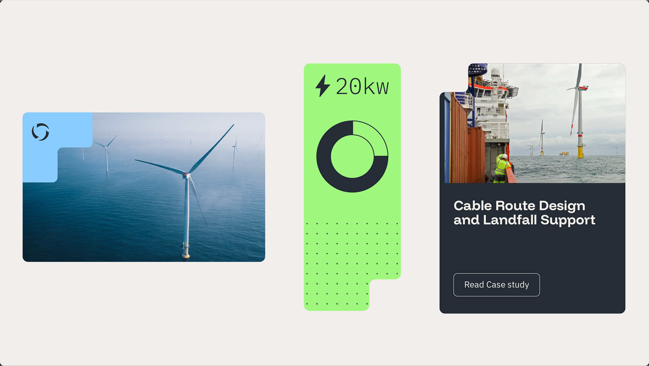
Ternan’s visual language is built around shapes inspired by pixels and single data points. These elements connect seamlessly with the typography, reinforcing a sense of deep expertise while also serving as a versatile design detail that can be applied across many contexts.


Brand guidelines & assets
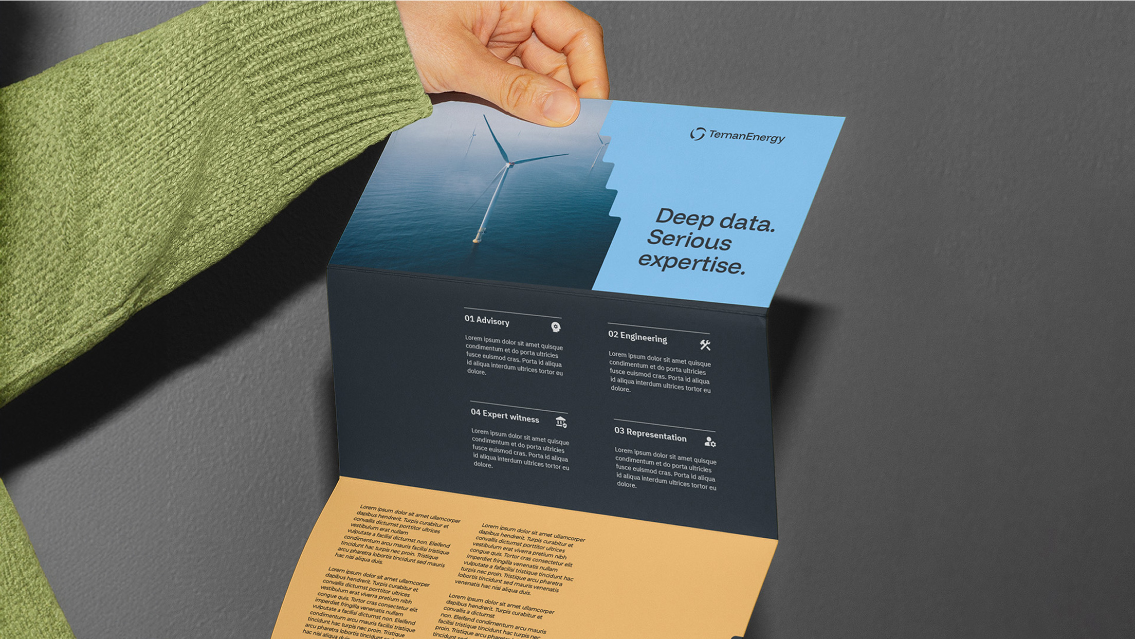
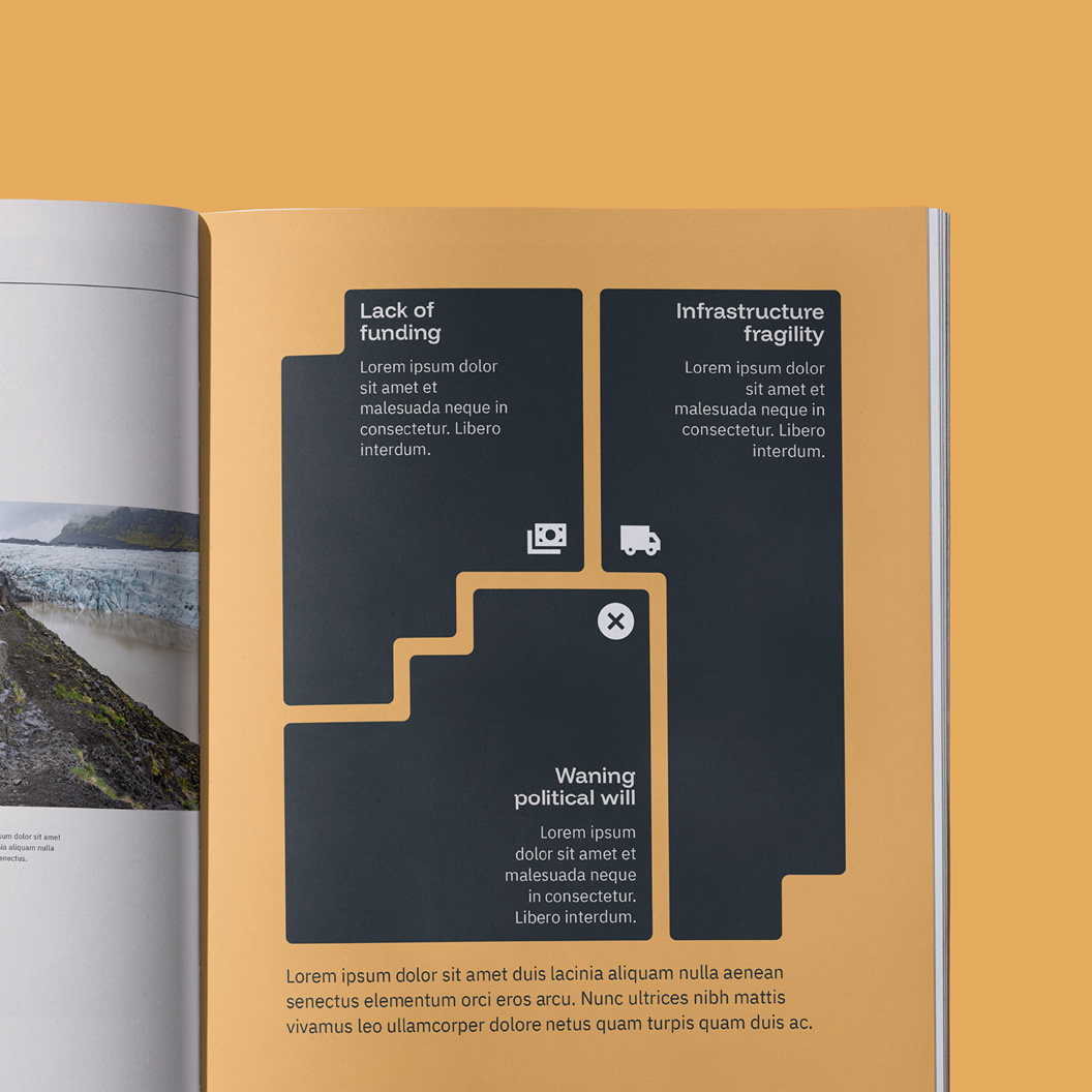
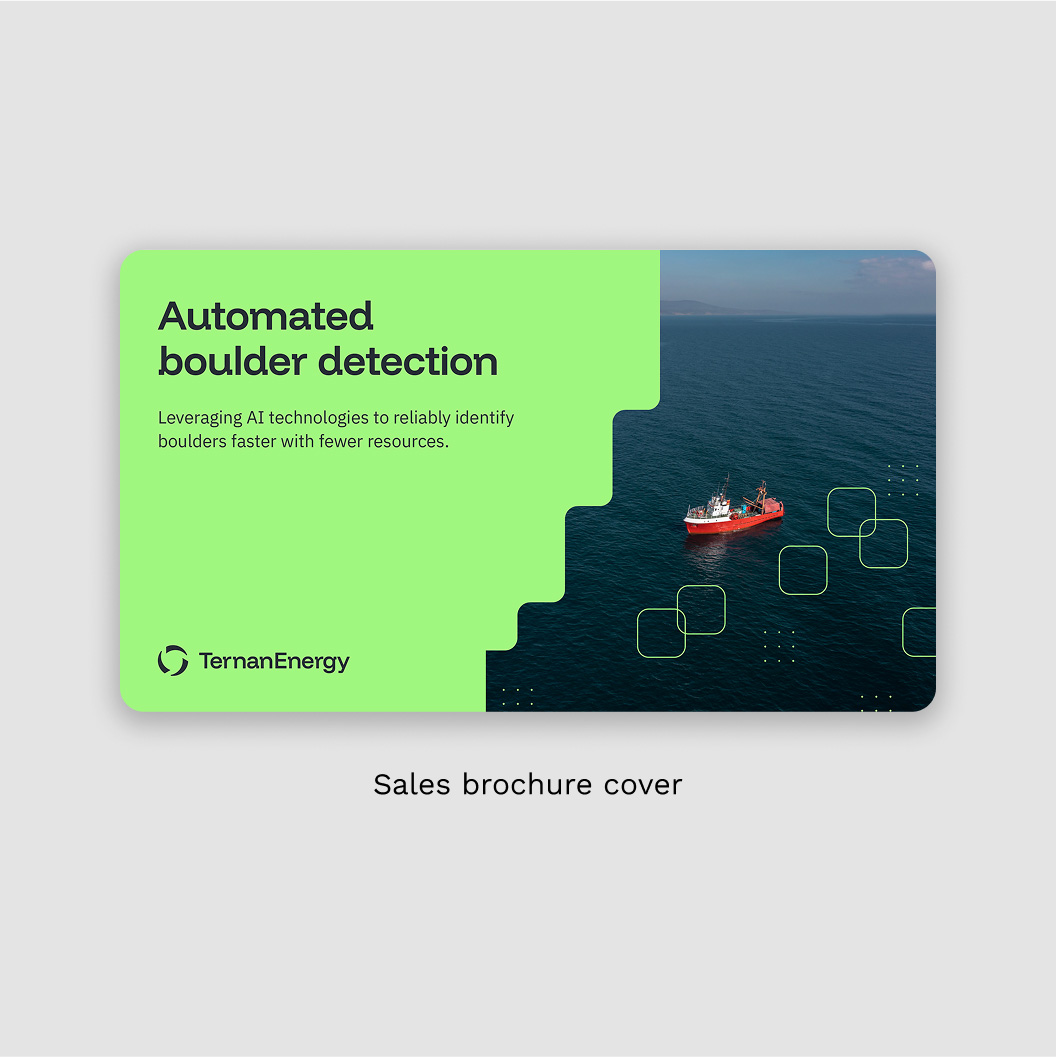
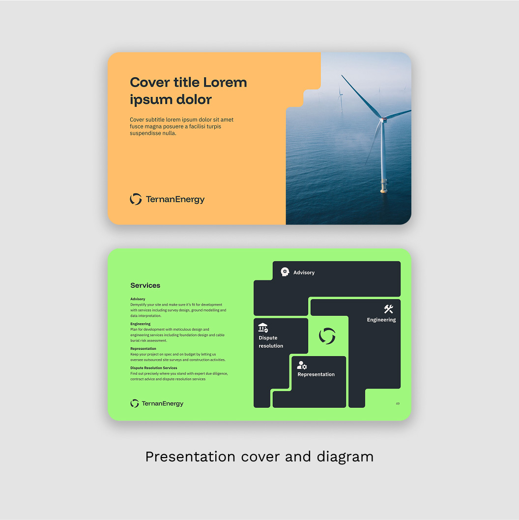
I created a comprehensive brand guidelines document with detailed instructions on how to apply the identity consistently. A key deliverable was a suite of sales materials, including brochures for Ternan’s services and templates for their core product: technical reports. These assets are used regularly and play a vital role in elevating the brand’s presence.
Additional deliverables
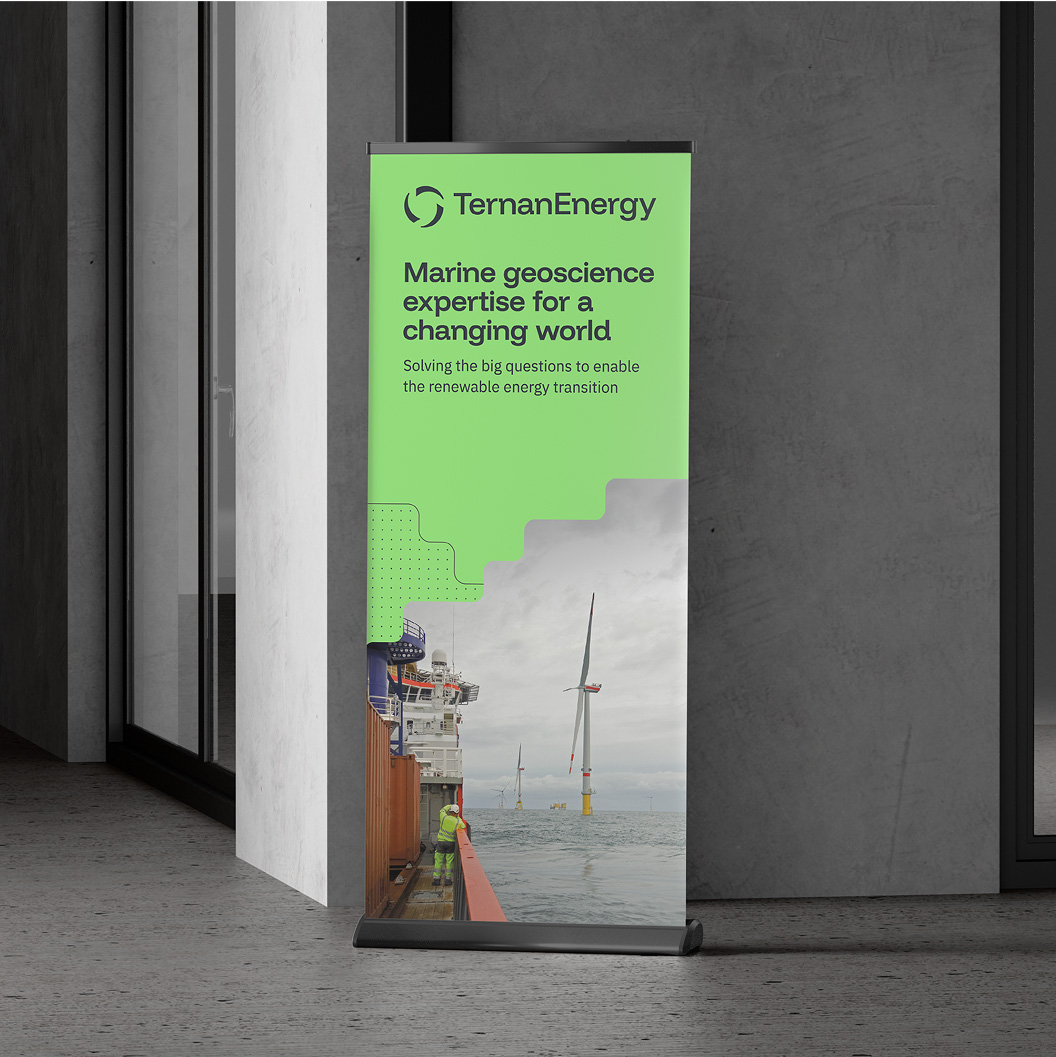
I also produced a pull-up banner and other event materials, along with templates for both print and web to support brand growth and ensure consistency. These assets help future-proof the brand.
