About
Creating a design system for Sift’s portfolio of news sites
Sift is the publisher of 5 different news sites, each one aimed at a specific profession (Accounting, HR etc). These sites had gone years without design input, and after injecting multiple new features to keep up with business demands, the UI had become disjointed and difficult to work with. With even more features coming down the line we knew we had to create a design system in order to avoid more inconsistencies. This was a highly collaborative project where I worked alongside development, SEO and multiple editorial teams in the UK and in the US.
Year
2019 – 2020
Responsibilities
UI Design
Research
Design debt
There was a considerable amount of inconsistencies in the UI, and one of the first things we did was to review the existing elements and styles, this helped us see exactly in which way each element was inconsistent. We managed to identify redundant elements and to see commonalities that we wanted to improve.
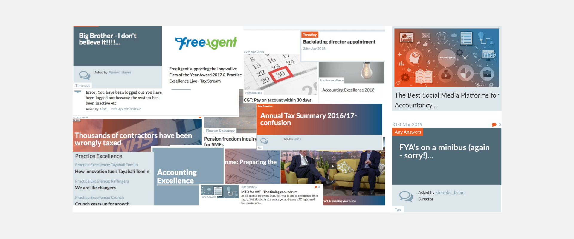
A lot of shades of grey-blue
The design system
Central to creating our design system was to update how articles are displayed, we focused on the card designs first and through a lot of trial and error we narrowed it down to 8 layouts. We ensured that these would work with the grid and updated it where needed.
We then redesigned the primary page layouts to work with these cards. We ensured every page that used this design system was thoroughly quality checked. We also created a style guide that would be crucial for the design team going forward.
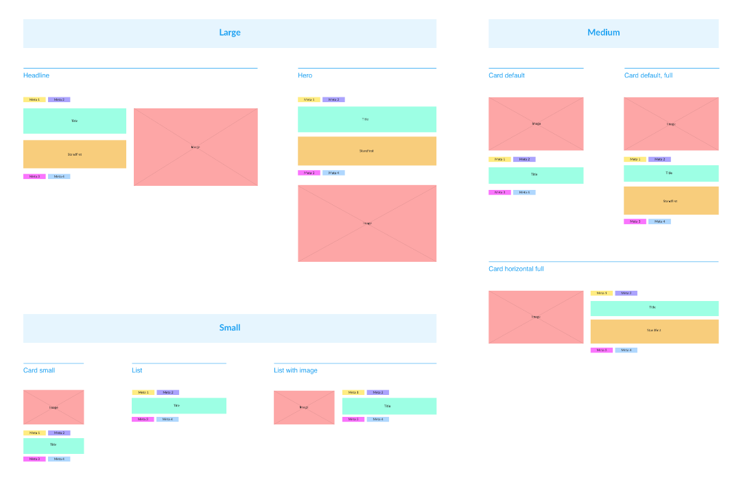
Design system card layouts
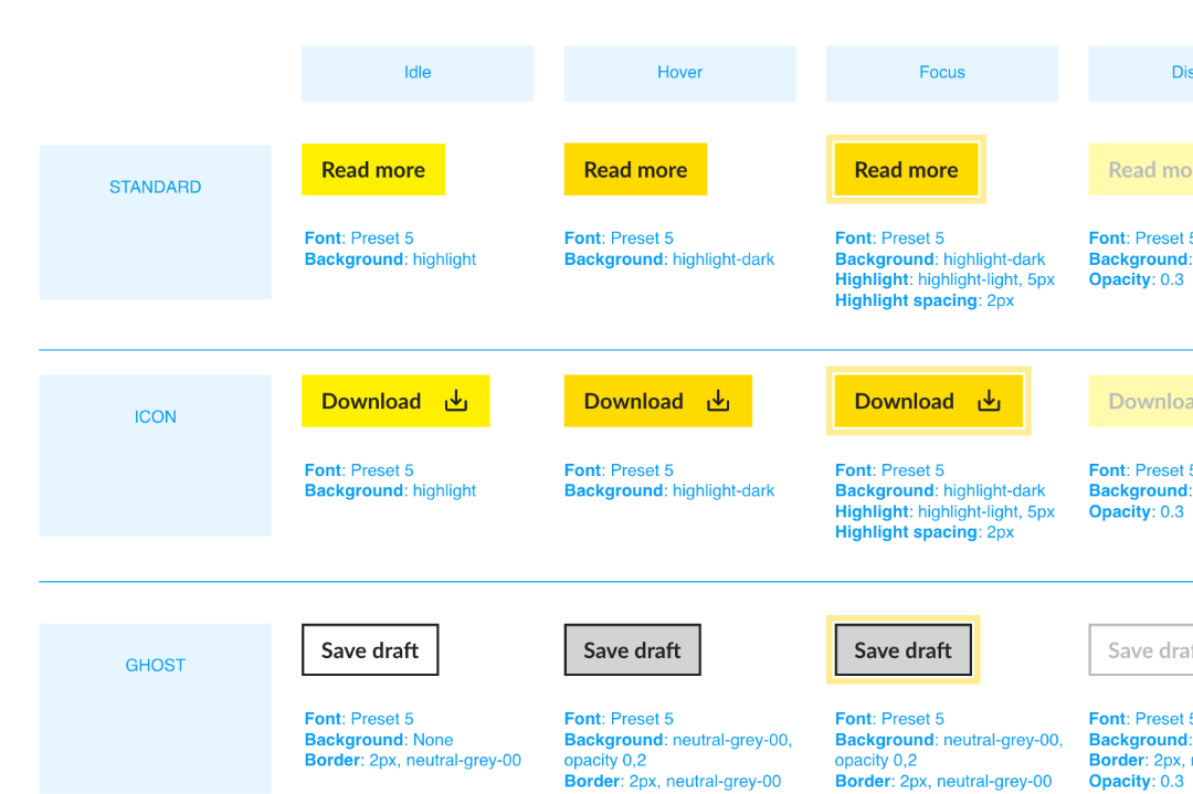
Style guide, shown here: buttons
Home page
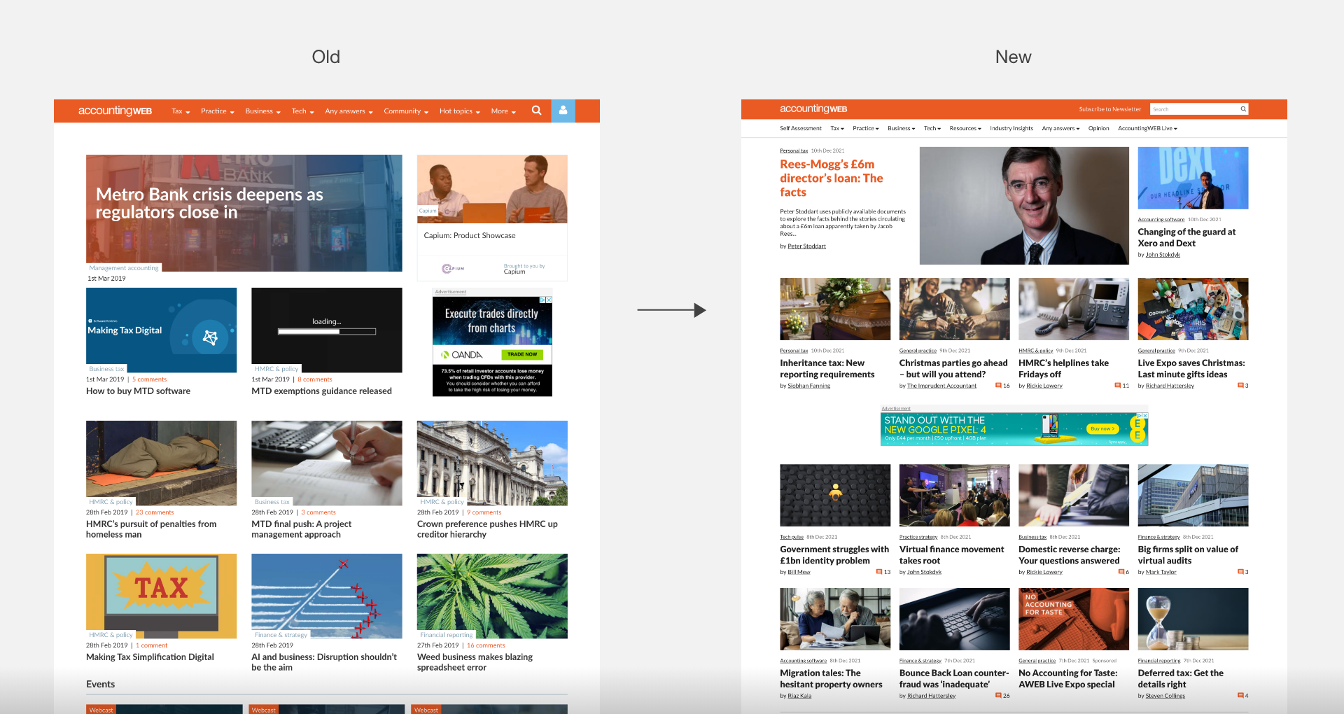
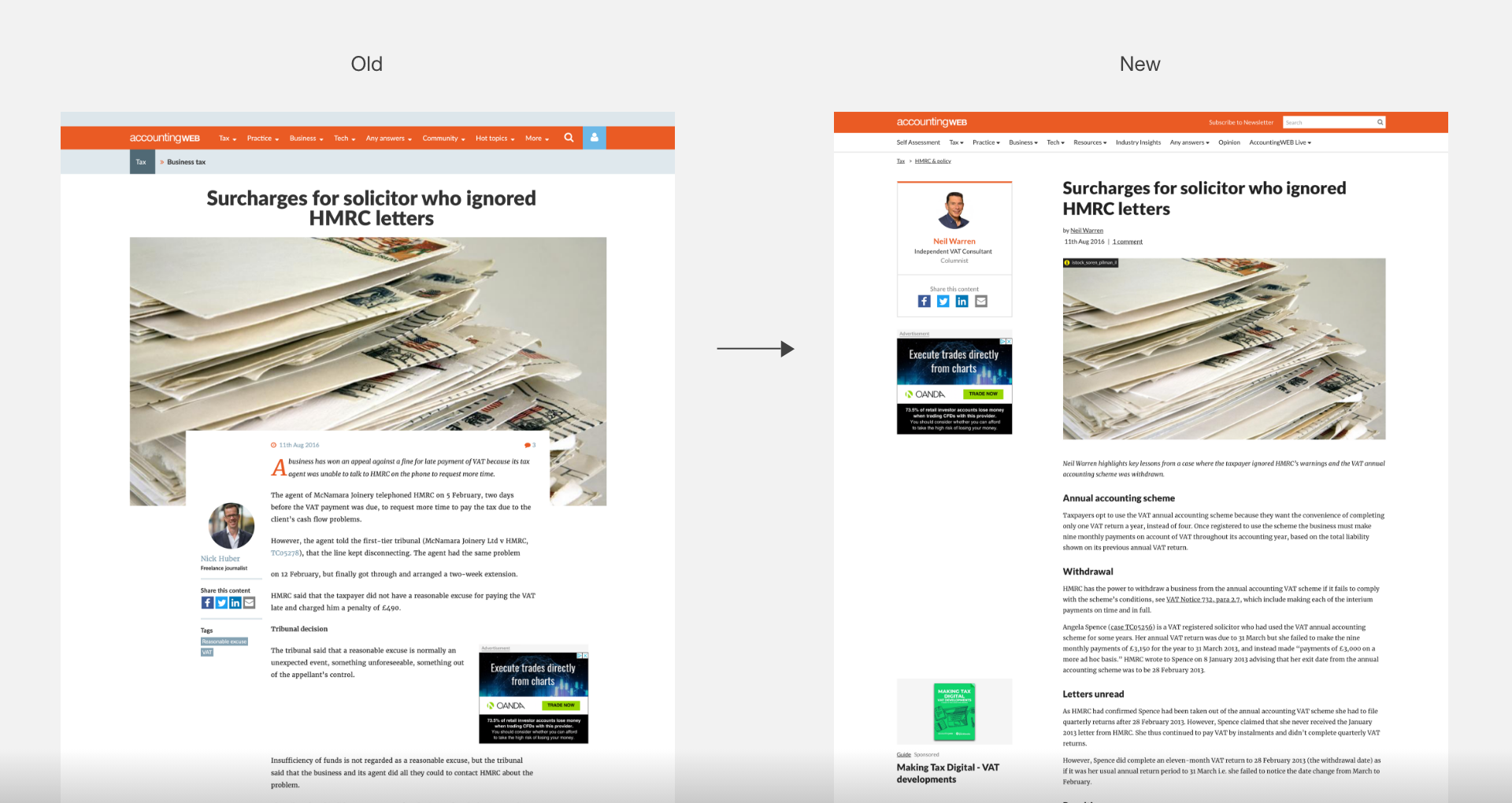
The old layout of the home page didn’t feel like the reputable publication we were trying to be. We took some inspiration from established newspapers, especially ones with printed newspapers, and we put more items above “The Fold”. With the news design system and grid this was a breeze. Other issues like an awkward ad slot and an ugly gradient overlay were also adressed.
Article page
The article pages gained a lot from the design system. The new layout increased articles SEO ranking. We created a column for sticky ads and related content, removing them from the body of the article, where they would often create ugly gaps. And finally the article body overlapping the article image was removed, which had often frustrated the editorial teams.
Card design & Navigation
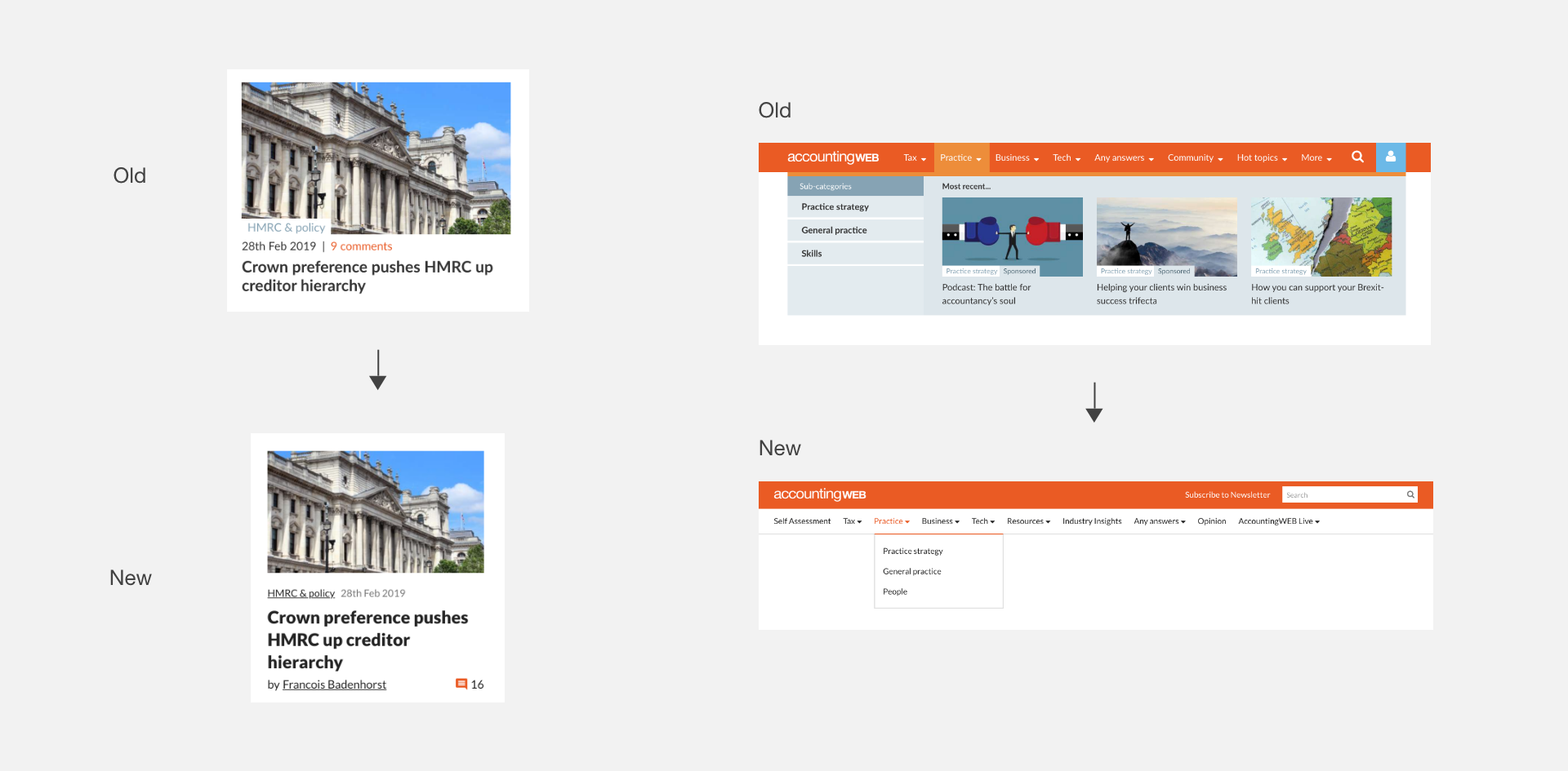
For the default card layout we removed any elements interfering with the article image, and also featured the writer’s name, and made the comment count more visible.
The navigation has proven in previous user tests to be highly ineffective, big, clunky and with unwanted articles. We simplified the design which not only looked better, but also allowed the editorial team some more flexibility and space to promote big news stories (the budget, covid)
Results
With the entire portfolio of sites brought in to the design system, we could bring these different brands more to life visually, it allowed for more flexibility for each editorial team, and the style guides meant we ensured a consistent experience across our various touchpoints, like surveys and newsletters.
It was a big project that could have possibly upset a lot of users, but we avoided this by rolling out the changes over the course of a year, and by the editorial teams communicating openly with their communities.
1,571,104
Unique users per month on average
3,028,035
Page views per month on average
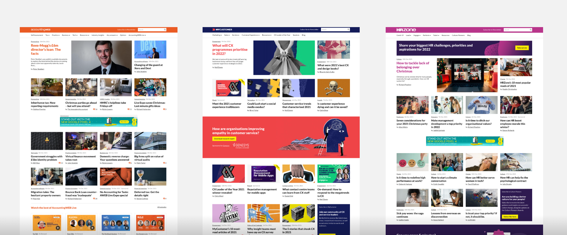
Home pages for AccountingWEB, MyCustomer and HRZone
Further projects
With the design system in place we could more effectively roll out other initiatives:
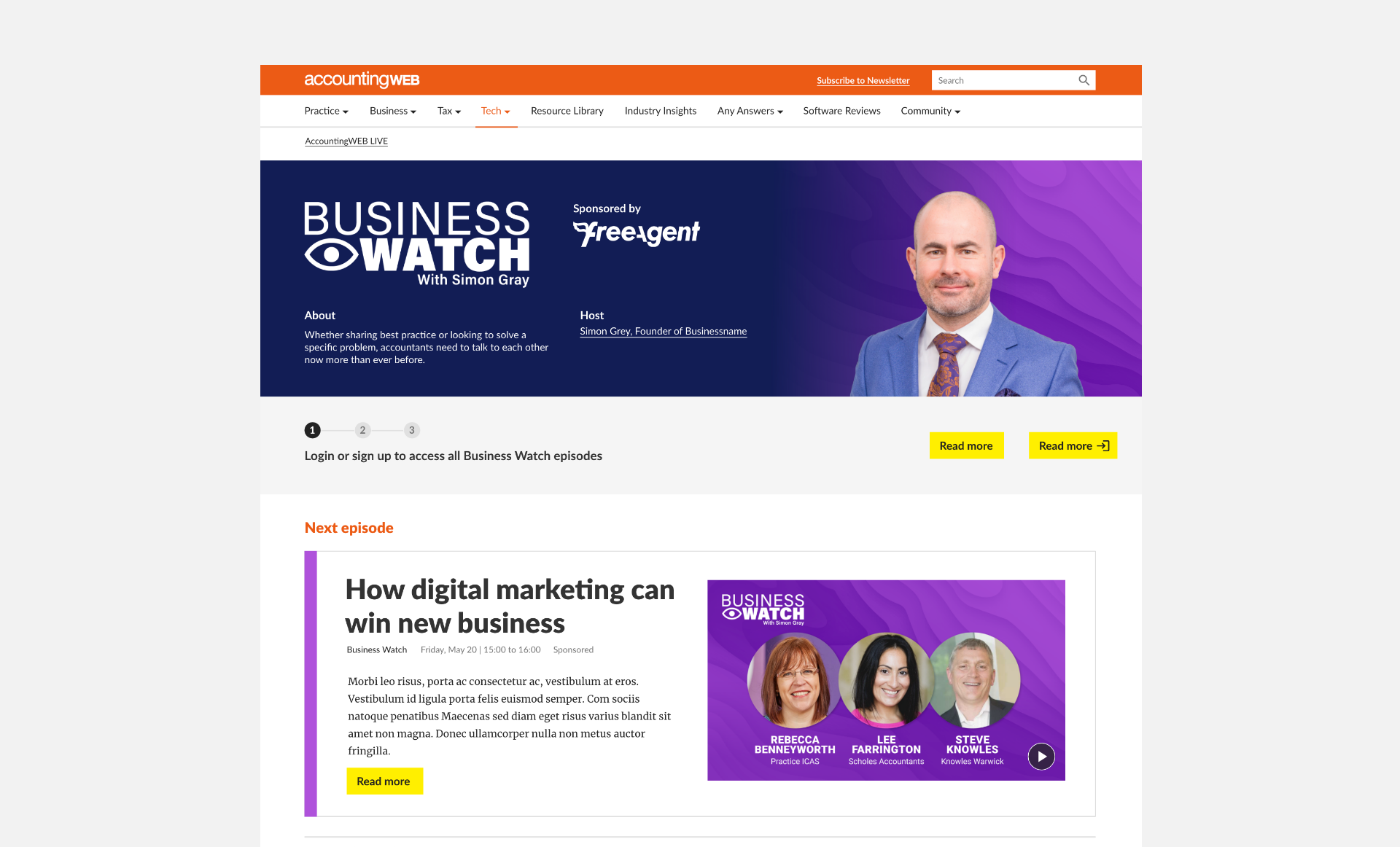
Webinar publishing platform
This project became key to the business surviving during the first waves of Covid, with their events programme now needing to take place fully online, this ensured sponsors were kept onboard and that the event was delivered effectively.
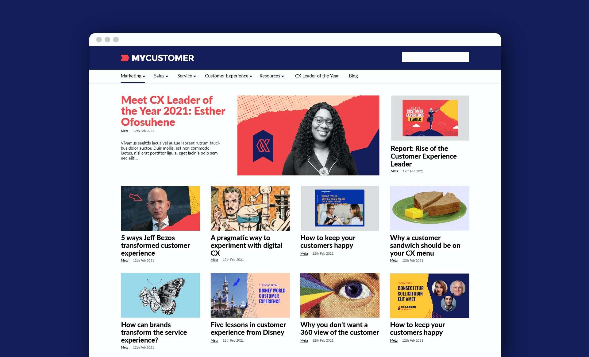
MyCustomer rebrand
With the design system in place, we could easier roll out rebrands. MyCustomer was the first to do so. Case study coming soon.
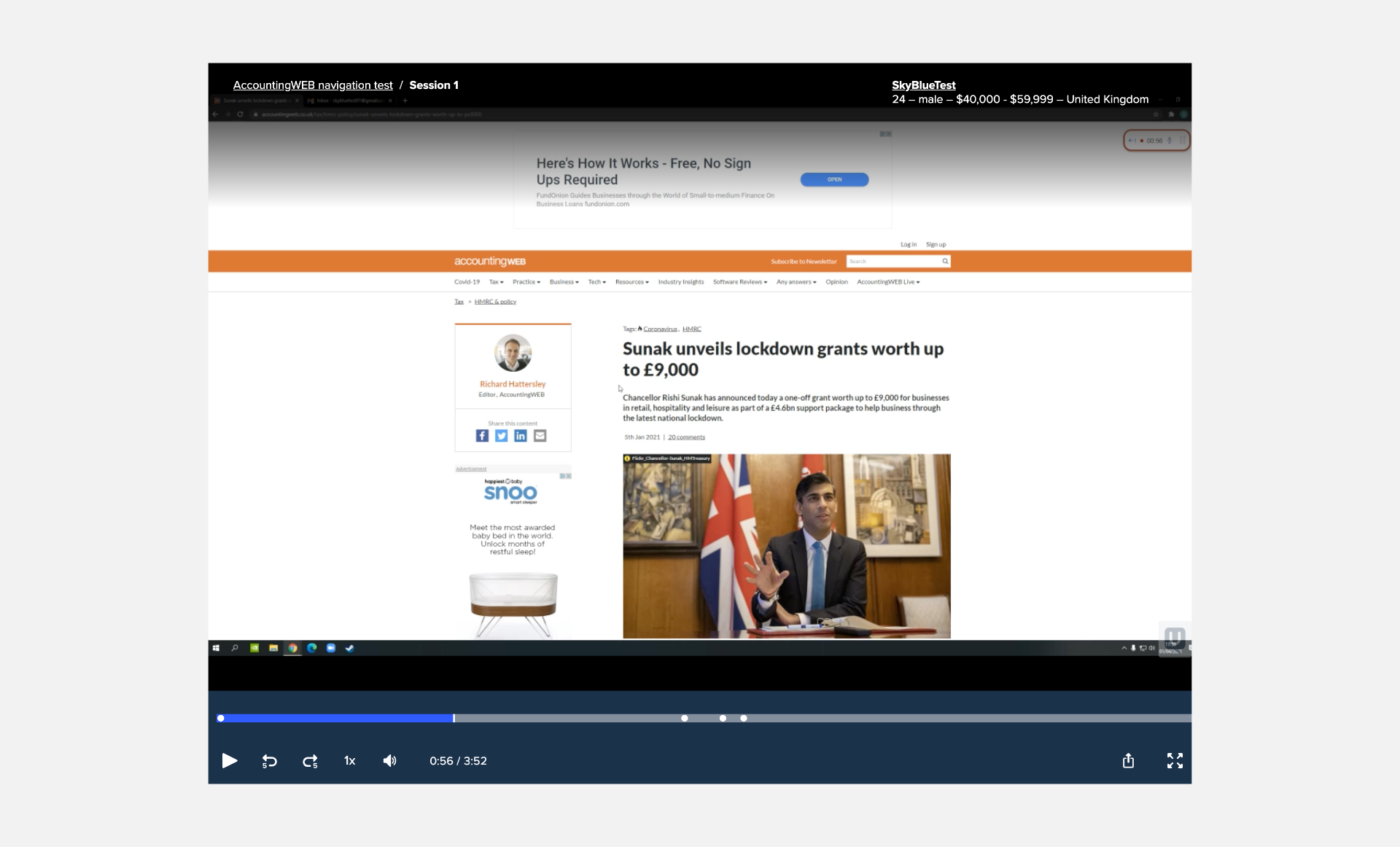
User testing
With the navigation simplified we could start user testing to improve users experience when browsing the site.
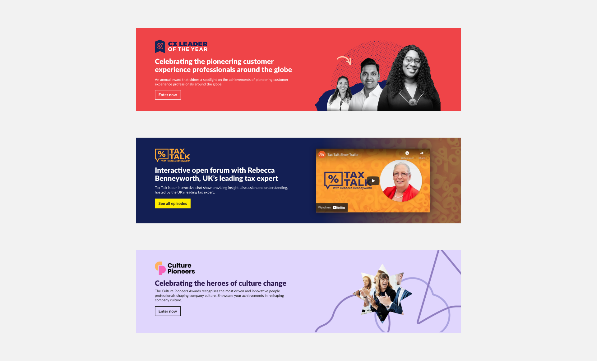
Promotional banners
Each business needed to promote their various initiatives, with the design system in place we had a great starting point to allow this.
What I learned
On a personal note, this project taught me a great deal. I learned a lot about design systems and how to build them,how to design iteratively, and I learned a bit about SEO too! But most importantly I learned how to be less posessive over my own ideas and allow for a fully collaborative approach.
Though it was far from straightforward, seeing it come alive was highly satisfying and easily one of my favourite projects.
