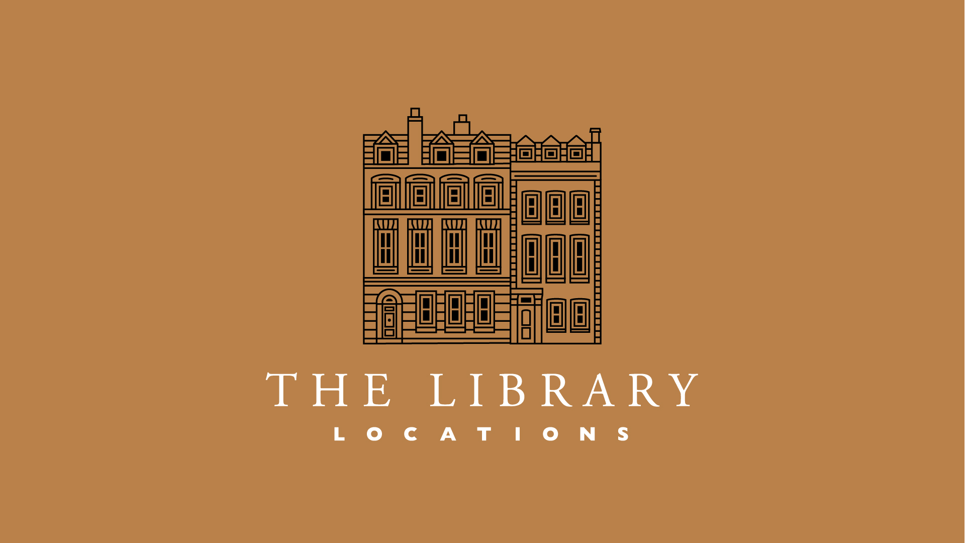
Naming and branding for a challenger finance brand
Rise audit
Naming
Branding
Logo design

Animated sting and alternate version
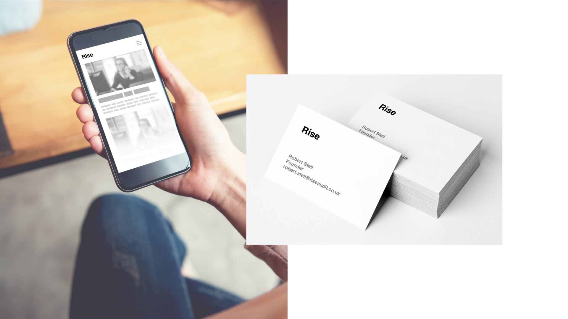
Collateral concepts

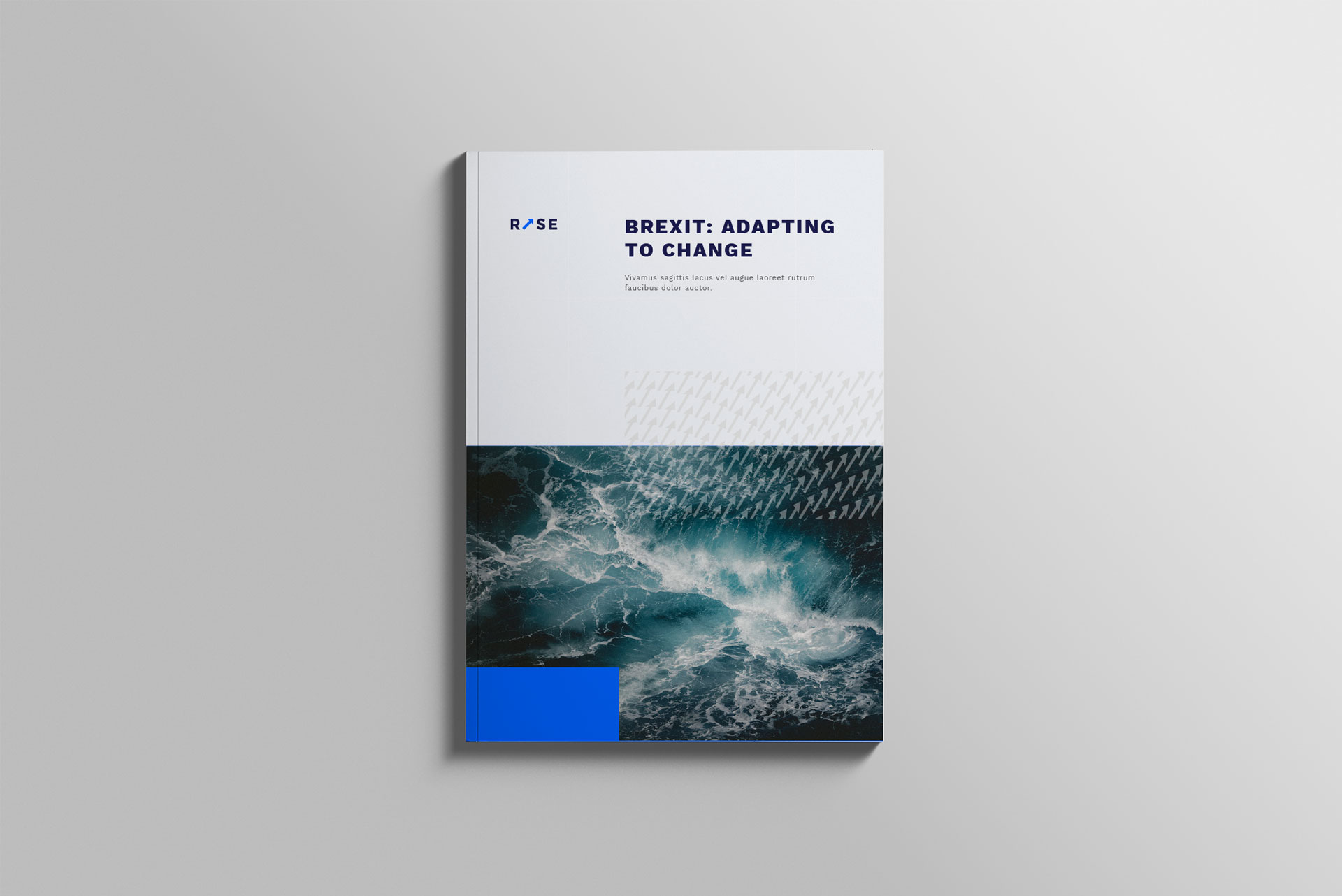
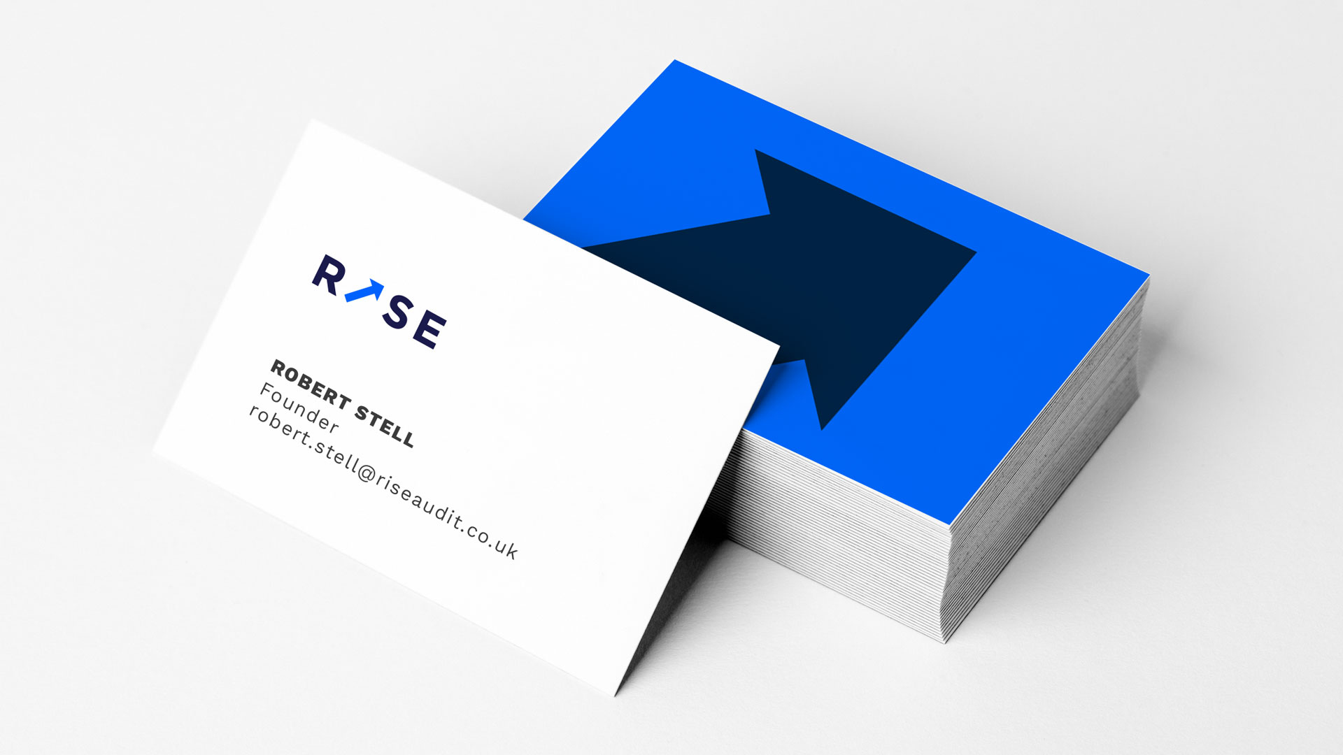
Lead gen downloadable guide, and businesscards. Brand pattern
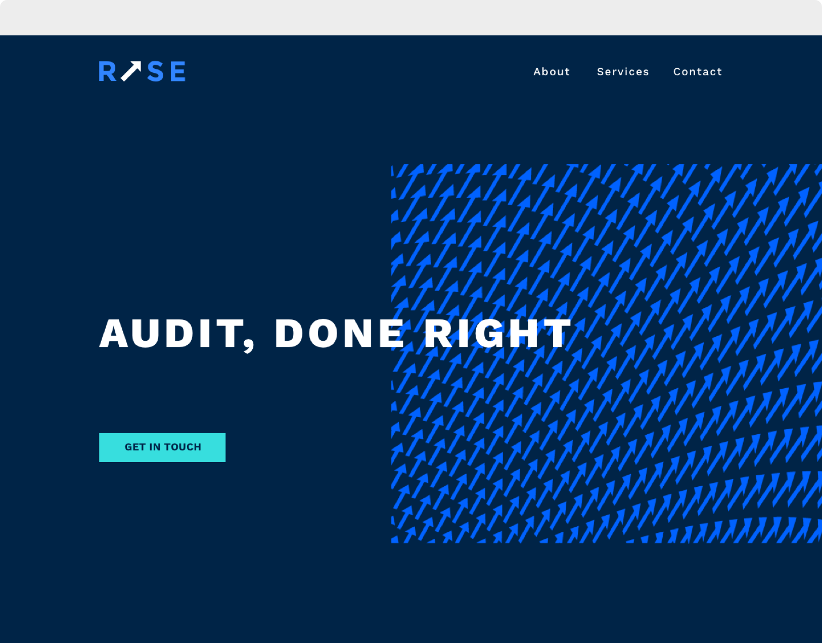
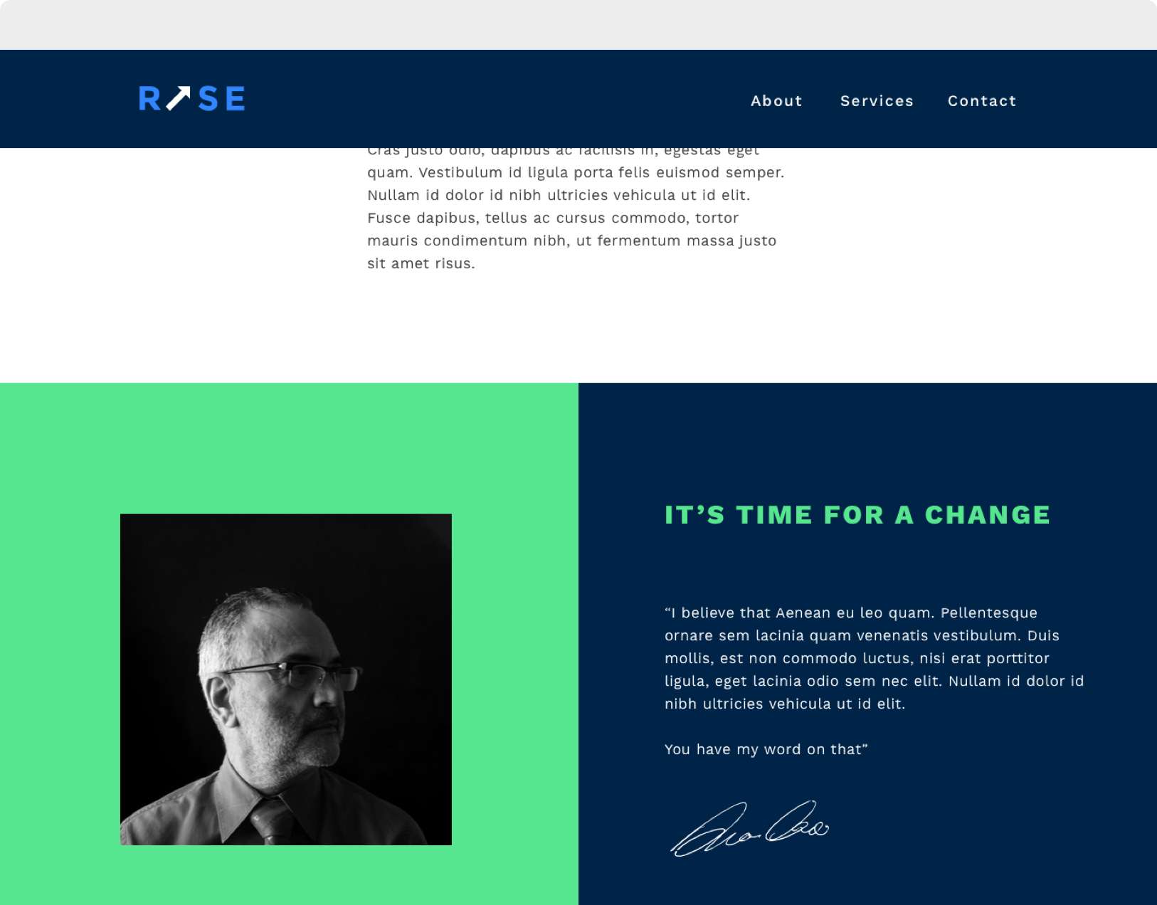
Website concepts
Style guide
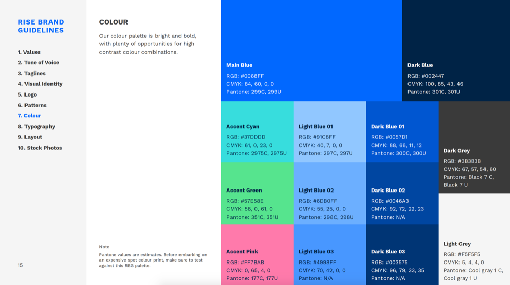
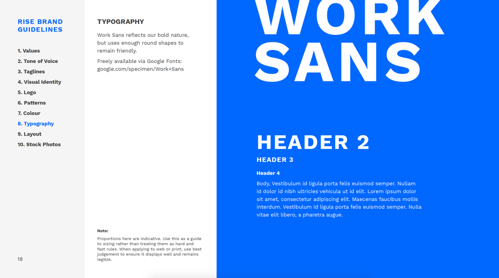
Contains guidelines on logo use, typography, colour use, tone of voice, pattern use, layout approach, photography usage
Process
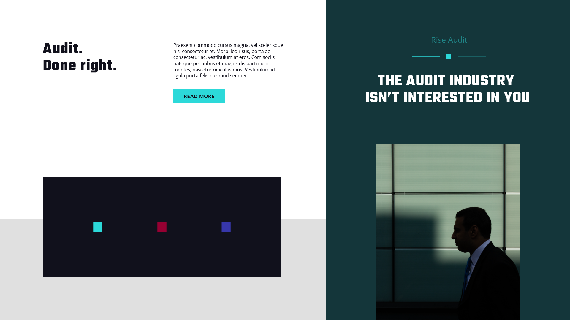
Problem
The client, a successful accountancy firm, wanted to be seen as a specialist in financial auditing, but had found it difficult to get that message across.
Solution
To set up a sub brand that looked and behaved completely different from the parent accountancy brand.
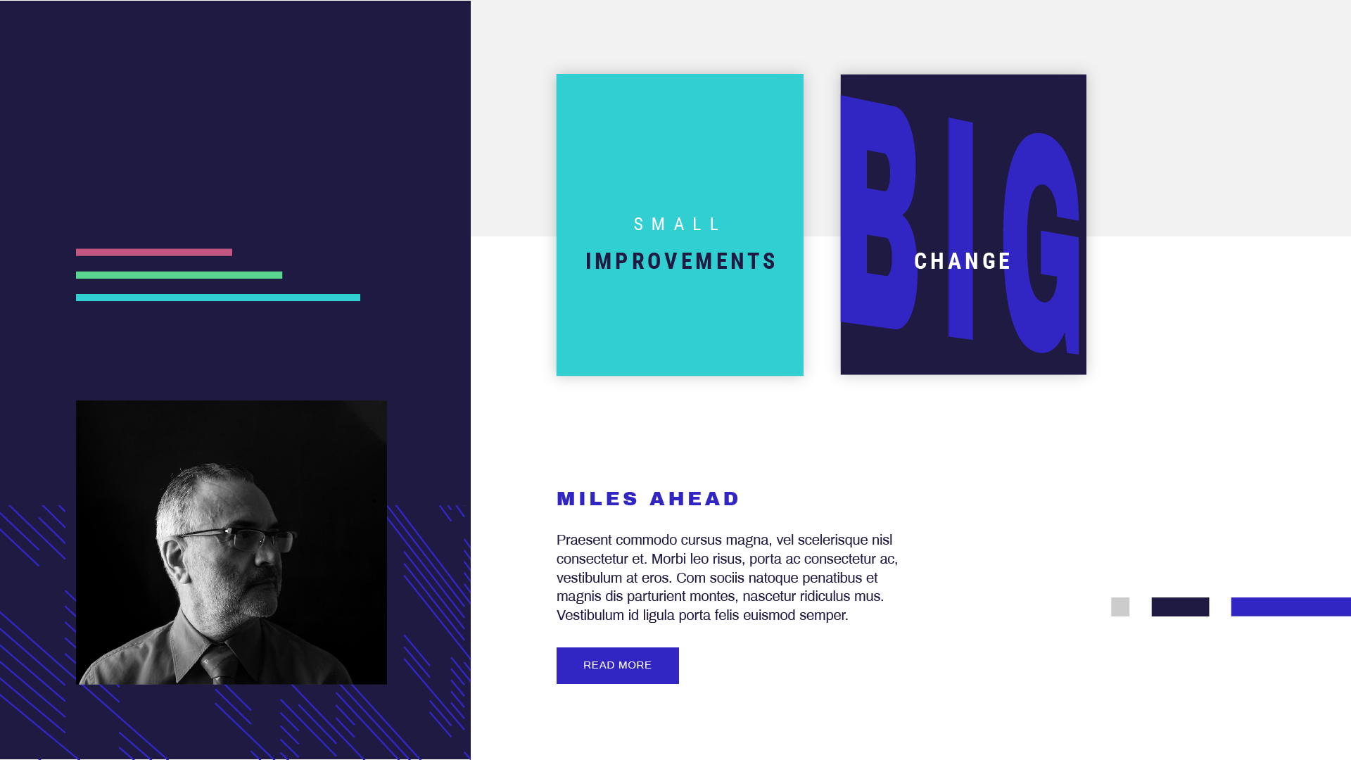
Challenging the status quo
The clients main target audience were mid-sized businesses with a very specific turnover, finding they are both too large for a regular bookeeper or accountant, and considered too small-fry for larger firms.
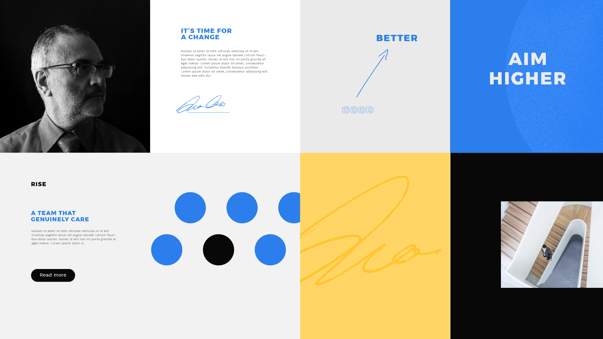
The client’s new sub-brand would be free to position itself exactly as it needed to help reach through to these businesses. It needed to be a defiant brand, a challanger, not afraid to shake thigs up.
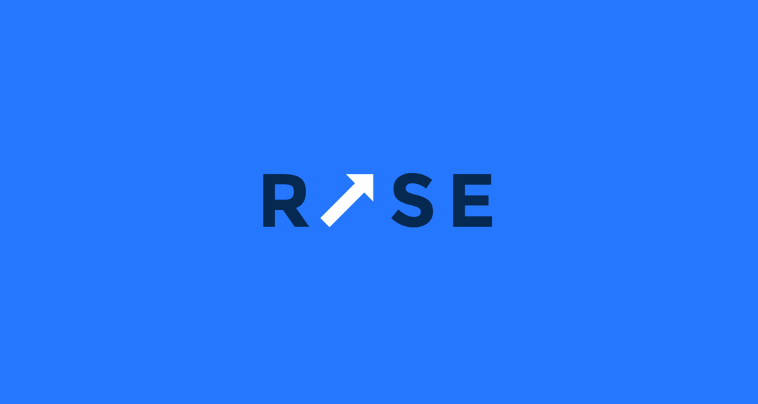
names generated
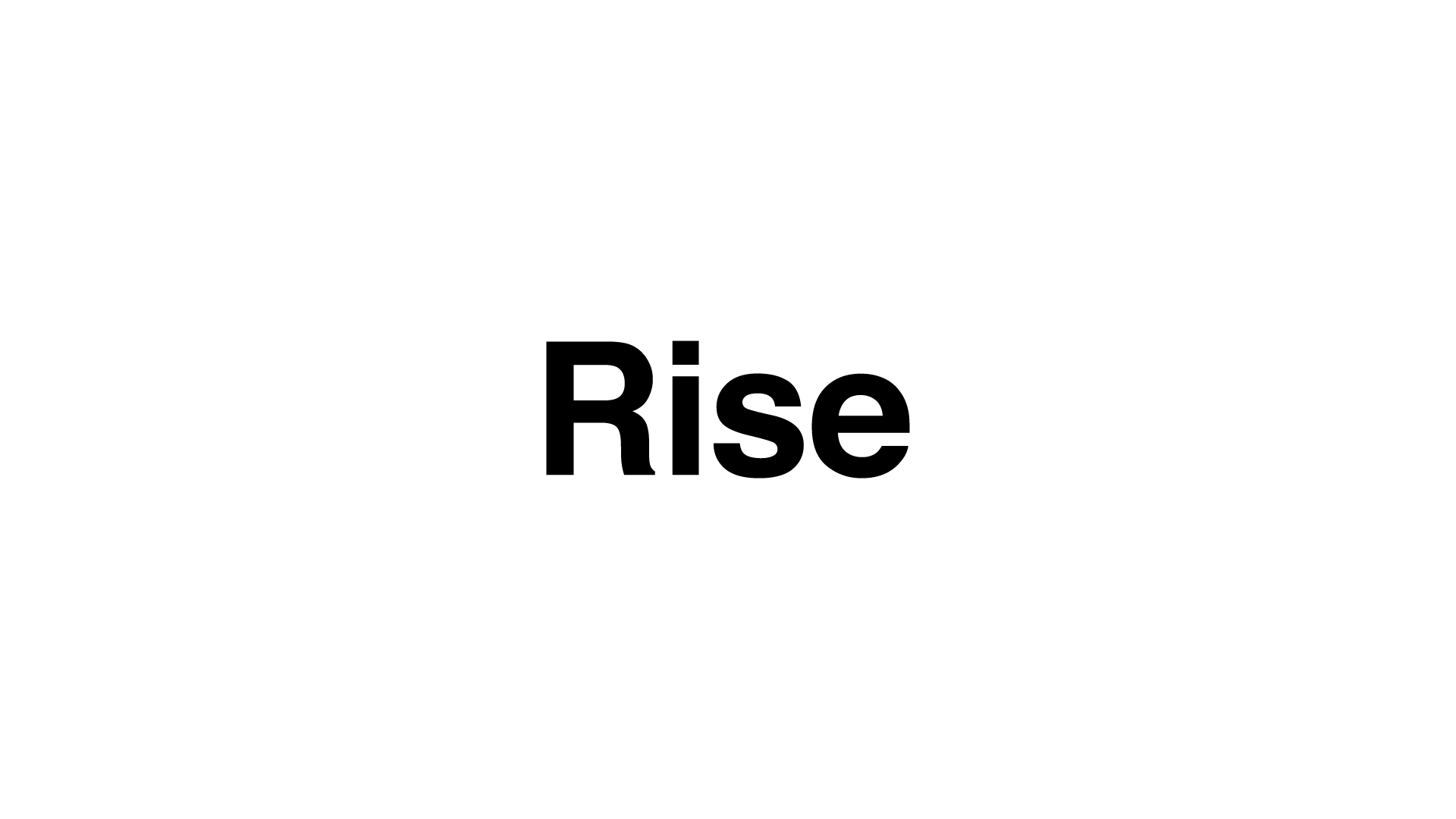
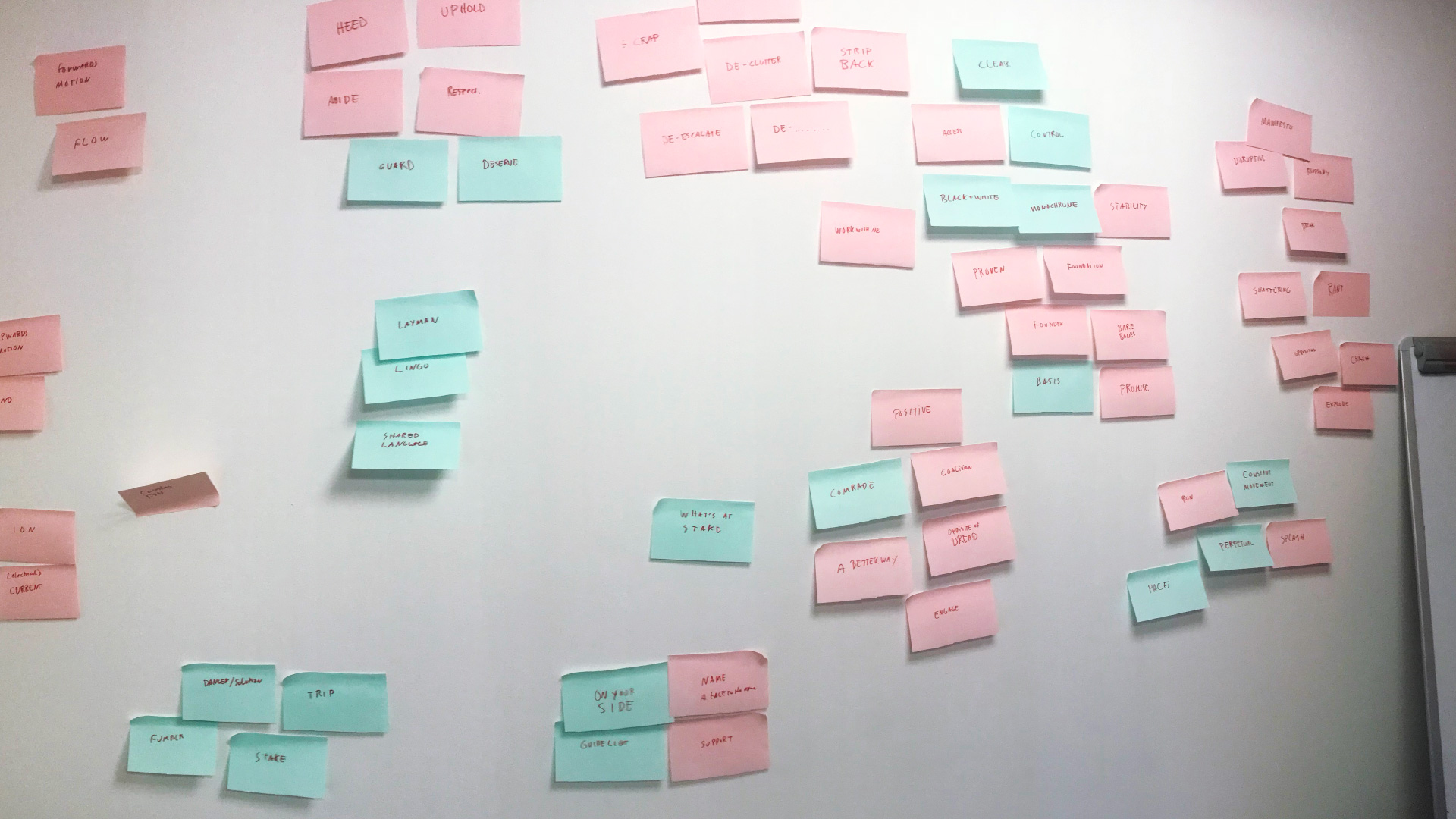
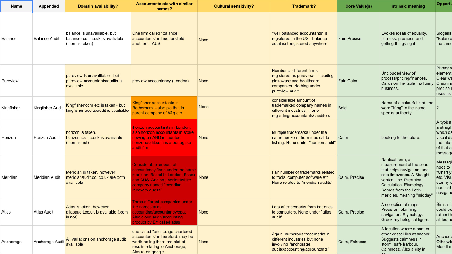
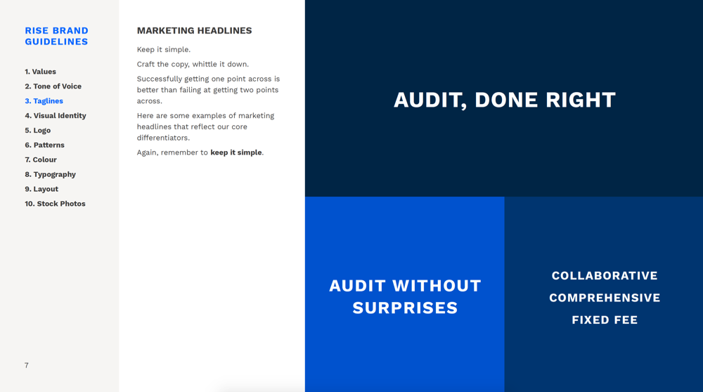
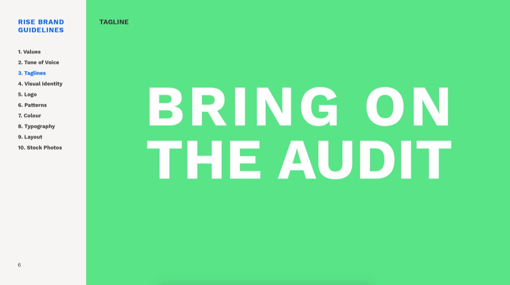
Naming would be key to standing out, so we conducted several workshops, generating 500+ names, followed by a thorough vetting process. We eventually landed on Rise, a name that reflects nature of the business
Concepts
After naming i provided three different visual directions. Each one reflecting a different facet of the challenger brand.
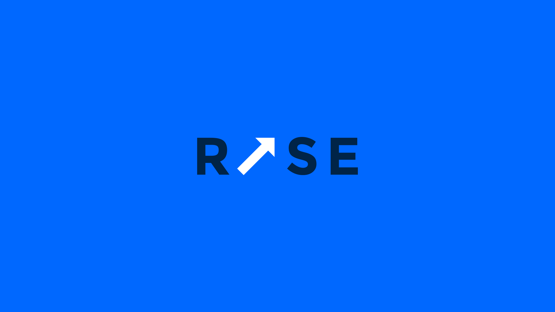
Logo design
The brands that Rise were aiming to challenge all followed a similar pattern to their logos. Each were named after their founders, and each used abstract meaningless shapes as their brand mark.
With Rise I wanted to challenge both of these finance hallmarks, with it’s name already meaningful the logo needed to be equally meningful.
Early concepts and competitor logos.
The final product
The simplicity and innate meaning in the Rise logo goes a long way to differentiate the clients’ brand from the competitors. This is all due to being hoenest with the client and not being afraid to go our own way.
The client now has the confidence to clearly and confidently speak about Rise, and it stands out against its competition in sharp contrast.
Outcomes
“I’m very happy with the work you have created here, i feel i have a bold and challanging brand, and that’s exactly what i wanted.”
Bradbury Stell